
Beginnings
Joan Couzyn was my first art master, and during the very early years he taught me those essentials which are so much the basis of his own art – honesty, a love and understanding of materials, and dedication. ((Skotnes attended afternoon art classes with Couzyn who was the art teacher at Con Cowan Junior High School in Johannesburg.))
Cecil Skotnes was born on 1 June 1926 in East London, the youngest of four children. His Norwegian father, Edwin Andor Skotnes, was an ordained Lutheran minister and missionary, but after his marriage to Florence Kendell, a Canadian and an active member of the Salvation Army, he, too, joined that organisation and devoted the rest of his life to social work among the needy. In time Cecil grew very close to his father and as a result he, like the older man, developed an intense interest in history, particularly ancient history. During Cecil’s adolescence his father was superintendent of a hostel for young men in Johannesburg. Since the Skotnes family had living quarters at the hostel, and often shared their meals with the inmates who came from various social and religious backgrounds, Cecil learnt that before God all people are equal. He attributes his interest in social upliftment, to which he unceasingly contributes in various ways, to this early background and his parents’ example.
Cecil enjoyed drawing and painting. Even while he was at Twist Street Primary School in Johannesburg he said that he was going to become an artist. During his first term at Con Cowan Junior High School the woodwork master, Joan Couzyn, a sculptor of considerable merit, observed the boy’s skill at drawing and decided to take him off the customary woodwork classes. He taught him modelling instead and Cecil’s career as an artist was on its way.
When Skotnes left school his father secured a place for him in a mechanical draughtsman’s office where he worked for about eight months. He claims that the experience gained there prepared him for the technical aspects of the large architectural commissions he was to carry out years later. In 1944 he left the office to join the army.
While his regiment was stationed in Milan after the Italian campaign, Skotnes went to Santa Maria della Gracie to see Leonardo da Vinci’s Last Supper. The visit was to be an almost mystical experience. When he arrived at the site of the monastery he found only one wall of the refectory standing, bolstered by sandbags to protect the famous painting that had miraculously survived the bombing of the city. This scene, and the wonder that the painting was saved, remained imprinted on his mind. He vowed he would come back to see the great work, and it was at that time that the dream to create a Last Supper himself was born.
In May 1945 Skotnes went on leave to Florence where he stayed until November. During this time he made watercolours and drawings, usually scenes along the south bank of the Arno which had been partially destroyed by the enemy. He met an Austrian artist, Heinrich Steiner, who had lived in the city for many years. They would come together to discuss art, and not infrequently the older man criticised the aspirant artist’s sketches, giving him valuable professional advice. Together they looked at and discussed the great art of the Renaissance. Skotnes felt particularly drawn to the work of Giotto, Donatello and Masaccio, artists whose austerity was akin to his own, and whose titanic figures were to serve as inspiration, and much later, as prototype, for his art.
Towards the end of 1945 the South African soldiers in Italy were translocated to Egypt to await transport home. During that time Skotnes attended formal classes at an art school in Cairo, but after meeting compatriot Gordon Vorster, who was in charge of the Helwan Art School, he left Cairo to supervise the smaller school in Vorster’s place. The South Africans returned home in mid-1946. To fill the time before becoming a full-time student Skotnes went back to work in the draughtsman’s office where he had been employed before he joined the army. Simultaneously he attended classes part-time at the Johannesburg Technical College Art School.
In 1947 he enrolled as an art student at the University of the Witwatersrand. The course in the fledgling Fine Arts Department was limited to painting (in watercolours and oils only), drawing (including ‘geometrical drawing’ to instil, it was believed, some professional discipline) and history of art. Graphic art was not part of the Wits curriculum, and, to underscore this limitation, Skotnes maintains that the word ‘woodcut’ was not even mentioned during his years at art school.
Among his fellow students were Larry Scully and Gordon Vorster (both, like Skotnes, ex-servicemen), Christo Coetzee and Nel Erasmus (all to become prominent artists and subsequently referred to as ‘The Wits Group’) and Esmé Berman, who became the first art historian to chronicle South African art comprehensively. Of their teachers, Willem de Sanderes Hendrikz, the sculptor who taught drawing, and Maria Stein-Lessing, the art historian, meant the most to Skotnes. In time he was to collaborate with Hendrikz on sculpture projects, and they remained friends until the sculptor’s death in 1959.
Maria Stein-Lessing was perhaps of even greater importance in Skotnes’ aesthetic and intellectual development. In the parochial setting of the Wits art school Dr Stein-Lessing, a Prussian Jewish refugee, stood out as an erudite art historian, unique in South Africa at the time. She was dynamic and eccentric. This kept her students spellbound and it inspired them to study, drawing their attention to fields of artistic endeavour that had been entirely unknown to them. Not only was she well informed on European art, especially that of the Middle Ages and the Renaissance, she was also conversant with and infectiously enthusiastic about twentieth-century developments. It was she who first introduced Skotnes to German Expressionism, which was later to inspire him considerably. She had, too, a wide-ranging knowledge of, and an insatiable curiosity about, African art. As a sideline to her teaching. Dr SteinLessing ran a small business, called L’ Afrique, dealing in African arts and crafts in downtown Johannesburg. This was like a magnet for her students. They often went there to browse and, inevitably, to indulge in stimulating conversation with their mentor who became their fiercely loyal friend. ((Dr Stein-Lessing died tragically in 1961. In 1964 Cecil Skotnes presented a portfolio of woodcuts to the Gertrude Posel Gallery, University of the Witwatersrand, Johannesburg, entitled In Memoriam Maria Stein-Lessing, Teacher, Counsellor and Friend.))
After completing the course for a BA Fine Arts Degree in 1950, Skotnes married Thelma Carter early in 1951, and together they went to Europe where they stayed for nine months. First they toured in Italy, Switzerland and France where Cecil gained greater insight into the work of Picasso and the Cubists who had been held up to the Wits students as their most important models. Then they went to London where they both found work to pay their way. In his free time (released from the dirty dishes he washed at Lyons tearoom) Cecil frequently visited the British Museum where he was impressed by the collections of ancient art, such as Egyptian, Assyrian and pre-classical Greek. In time these impressions, and the subliminal messages from bygone civilisations conveyed through their art, would be assimilated into his own work. But his greatest discovery (in terms of his early development as an artist) was the large collection of African woodcarvings and Benin bronzes.
Skotnes also studied the contemporary art scene. He felt a strong affinity for the work of Henry Moore, especially the large pieces which he saw for the first time at the great Moore Exhibition in Battersea Park. He became a member of the British Contemporary Arts Society, and as such attended the opening by Kenneth Clark of a Graham Sutherland exhibition. The lingering influence of this artist on Skotnes is to be seen later in some of the anthropomorphic landscape woodcuts of the mid-fifties.
Skotnes believes that, had he stayed in England, he could have become a typical British artist. But he felt alien in England; he could not be creative there, and so, after a seven-month sojourn in London, he chose to return to South Africa and develop along uncharted lines. Back in Johannesburg, he took up an appointment with the Johannesburg City Council Non-European Recreation and Community Services, which led to his becoming the cultural recreation officer in the townships. In this capacity he developed the Polly Street Art Centre which, in retrospect, is acknowledged as greatly important in South Africa’s history of art. He also resumed painting.
Early landscape
My entire art grew out of the landscape. I tried to create a unique South African formal language by analysing the landscape – inspired by the forms which the indigenous art had already identified, and also against the background of Pierneef. ((Cecil Skotnes speaking to Johan Bruwer, “n Taal uit eie bodem’, Beeld, 30 Julie 1976. Translated by Frieda Harmsen (henceforward FH).))
Although Skotnes painted many still lifes at the beginning of his career, ((Skotnes showed drawings and paintings of both still life and landscape on his first professional exhibition, held jointly with Larry Scully, at Whippman’s Gallery, Johannesburg, in 1955. The landscapes were especially acclaimed by the reviewers. Subsequently Skotnes showed landscapes on group exhibitions. That the works were considered desirable is suggested by the fact that in 1956 African Landscape was stolen while it was awaiting exhibition at the Lidchi Gallery in Johannesburg.)) he emphasised the importance of landscape as a formative influence in the development of his iconography. Like several of his contemporaries (notably Erik Laubscher, Gordon Vorster and Gunther van der Reis), he strove to subject the scenery to a more cerebral formal construction. But above all he endeavoured to penetrate beyond the visual impressions of the South African landscape that had been recorded so well by earlier artists such as Oerder, Wenning and Naudé. Hence Skotnes’ interest in Pierneef who not only formalised the landscape, but, as Skotnes believed, was the first to lay the foundations for a uniquely South African pictorial idiom. The structured composition and the stark tone contrasts in the older artist’s work also appealed to the austere Skotnes temperament. His work still reflected the formalist training he had received at art school incorporating – particularly in the still lifes – unmistakable references to Cézanne. But even at this early stage a sense of universality with metaphysical overtones emanated from his work. He himself did not, however, burden his ideas about his art with deep philosophy. ‘My approach is simple,’ he said in 1962. ‘I attempt to interpret as realistically as possible the way I see my environment – that is my physical environment – and the spiritual influence it has on me.’ ((Transvaal Art Catalogue, 1962.))
His landscapes of the early fifties, almost invariably of rocky desert or rough mountainous terrain, entitled, for instance, Karoo and Basutoland, are harmonies of greys, contrasted with sultry blue, and occasionally enlivened by a flush of red. Formal structure, inspired by the contours, rocks and stones of the scene, is the essence of these compositions; colour is almost incidental. The artist’s main concern was to evoke a state of mind rather than the specifics of a region. The location is recorded primarily as a point of reference for the viewer.
At the time Skotnes set out on his career as a professional artist, Egan Guenther – a goldsmith and former gallery director in Germany – immigrated to South Africa. He had impeccable artistic taste, was well informed on contemporary art in Europe and also highly knowledgeable about African art. He readily recognised talent in others and encouraged and nurtured this not only by acting as dealer, but by means of animated and dictatorial discussions about art in general that challenged and stimulated his new South African friends and protegés.
Skotnes was introduced to Guenther towards the end of 1954; the meeting proved to be a turning point in the the artist’s career. In those years he was a painter and draughtsman and had not considered making hand-printed works. In fact, at the time woodcutting and the other graphic media were virtually unknown to him.
At Guenther’s I saw woodcuts at close range for the first time, and he gave me my first set of tools and showed me how to handle them. I also became acquainted with German Expressionism and the great similarities between it and tribal art, though I had developed a stylistic basis long before I became aware of the importance of the tribal art field. ((Cecil Skotnes speaking to Dale Lautenbach, Cape Argus, 24 April 1984.))
Guenther showed Skotnes woodcuts by several modern German artists, but he sensed that those by Rudolf Scharpf, a relatively unknown artist who had been one of Guenther’s protegés in Germany, would be of particular importance to the South African. Skotnes responded with alacrity, not only to the style and content of the prints, but to the medium of woodcut. While learning to use the unfamiliar technique, he discovered that, as he put it, he cut his shapes with greater surety than he drew them. ((‘Habitat interview Cecil Skotnes’, Habitat, No.7, 1974. )) In his enthusiasm he abandoned painting, only turning to it again seven years later.
The very earliest woodcuts – abstractions derived from rocks, thorns and grass – bear a close resemblance to those by Rudolf Scharpf, but soon Skotnes strove to create an essentially African idiom. ‘As chronicler of the South African situation I could not think in European terms,’ he said. ‘My approach had to originate here, otherwise my art would be a lie of little importance.’ ((Cecil Skotnes speaking to Johan Bruwer, “n Taal uit eie bodem’, Beeld, 30 Julie 1976. Translated by FH.)) Consequently his designs became more harsh in appearance to evoke the African atmosphere of arid savannah and thorny bush.
Guenther drew Skotnes’ attention to the beauty of the blocks from which prints were pulled, and suggested to him that the block could be refined and presented as a work of art in itself. In 1956 Guenther gave him some pieces of parquet flooring and suggested that he should cut designs on them. These modest carvings, intricate black compositions against white backgrounds, were to be the first of the Skotnes ‘incised paintings’, ((‘I began to make bigger panels and to colour the panels on the surface. These became incised paintings. The first time I had a bit of trouble with them was in the USA – the customs didn’t know what they were, they were neither paintings nor sculptures, and only “art” is allowed in duty free. There and then I had to make a description of them which still stands – “an incised painting on wood”.’ ‘Habitat interview Cecil Skotnes’, Habitat, No.7, 1974.)) although not then identified as such.
From this time on Skotnes cut blocks from which to pull black and white prints. When the edition was complete, he embellished the gouged-out backgrounds of the better blocks with marble dust and coloured oxides, rolled solid black over the raised surfaces, and mounted them as autonomous works. The effect was, as Charles Eglington observed, ((Charles Eglington, ‘Cecil Skotnes, wood engraver’, Contrast Vol.3, no.4, July 1965.)) not unlike stained glass with rich black set against luminous colour. But there is no suggestion that such panels simulate stained glass because the character of the wood always remains dominant.
Even though Skotnes regularly reverted to oil and watercolour painting and drawing with charcoal, chalk or pencil, the woodblock as an incised painting was to remain his favourite medium (besides print-making) for several decades. He sometimes adapted panels to serve as doors or pelmets. The earliest of these (commissioned by the architect, Donald Turgel, in 1959 to serve as the front door to his house) retained the prickly, angular shapes that had been inspired by natural veld vegetation. Later the scraggly, thorn bush-like figures with their agitated, dancing movement gave way to more readily recognisable human forms that face the viewers full square.
Also in 1959 Turgell commissioned the artist to make his first mural. Skotnes, who at that time was convinced that he was a cutter and not a painter, devised an unusual, perhaps unprecedented, technique for the work which suited not only his temperament, but the unconventional area on which Turgell wanted the decoration. The brick surface in question is a divider between two rooms and does not reach the height of the ceiling. It is continued outside to separate two areas of a terrace open to the sky. Nearby was a bank of weeping willows which inspired Skotnes, the landscapist, to bring, so to say, the garden into the house by repeating the trees’ general shape and rhythm, but in a drastically simplified and invigorated idiom.
Skotnes used a technique of coloured cement laid into lime plaster. The wall is covered with a layer of plaster, and, while it is still damp, the design is cut into it. The colour (in this case black) is trowelled into the cut-out spaces. The excess colour is scraped away leaving a crisp line drawing somewhat reminiscent, Skotnes says, of Japanese woodcuts on mulberry paper.
The artist used the technique to make several more murals in the same year. The designs are less severe than in the Turgell mural, showing a greater confidence which allows light-hearted humour to infuse the images as vivacious hominoid figures displace the earlier vegetation.
More commissions for murals followed. In 1963 Skotnes fell into a lyrical mood, inspired no doubt by the garden in which he worked, when he embellished an exterior wall of a private residence in Observatory, Johannesburg. He incorporated the shapes of the succulent plants, the lines of the foliage and vines, the patterns of the flowers, and echoed the shadows cast by the branches of a spreading tree nearby.
In the same year he adapted the inlaid cement technique to suit an exterior setting exposed to full sunlight for a three-storey high mural on the entrance facade of the Technical High School in Pretoria Gardens. The environment is harsh, dusty and blustery. He therefore created a design that resembles a wind devil reeling over the wide expanse of veld. The deeply gouged lines are not filled in with black plaster as in the other murals. The drawing is therefore grey, not black, and, during the course of the day, the image and quality of the colour change as the shadows and highlights shift according to the position of the sun and, on some days, the random vagaries of cloud. ((The gouged technique without colour was used for a few other murals, some of them in interiors such as the embellishment of the lift shaft of the Frik Scott Library of the Medical Faculty in Bloemfontein, 1976.))
In about 1961, inspired by weathered primeval rocks and sunbaked earth, Skotnes turned to drawing and oil painting once more and made a series entitled Rock Faces (shown at the Egan Guenther Gallery, Johannesburg, in 1962). In these works Skotnes used colour evocatively. The surfaces glow with reds, yellows and ochres which are set against dark browns tinged with earth greens. A mysterious world seems to open up before the viewer, who is led into deep caverns of subconsciousness. It is in such places that religions are born. Beyond The Face of the Desert, The Place of Caves and Volcanic Castle we find Metaphysical Landscape, The Temple and The Altar. From them arose The Legend (Gertrude Posel Gallery). At the time Skotnes said, ‘Many shapes incorporated from my other paintings have been simplified in The Legend and it is perhaps the climax of my work’. Like the others, The Legend is an impression of a rock face. As in the real rock faces of our krantses it seems to teem with apparitions and phantoms that recall cities with tall buildings. These may metamorphose into the beings who populate such places and they, in turn, become symbols of our spirit and intellect.
In retrospect Skotnes claims that in these Rock Faces Willi Baumeister’s influence had asserted itself. He had discovered Baumeister (a German painter, 1889-1955) when he visited Egan Guenther in Johannesburg for the first time in 1954. There he saw a landscape painting which, he recalled years later, ‘was the most marvellous thing I had seen in years’. Athough at that stage he could not explain the elusive attraction it held for him, he immediately felt a profound affinity for it. During the seven years that he did not paint, the German’s vision became embedded in the young South African’s mind and it surfaced in the landscapes of the 1960s. Only later, after he had read his life story, (( Skotnes considers Willi Baumeister: Life and Work by Will Grohmann, 1963, to be one of the most valuable and influential books he owns. It is permanently on hand in the studio. Its grubby and tattered condition testifies to its constant use.)) did Skotnes realise how great his indebtedness to Baumeister had been.
Quest for the soul
As Skotnes painted his landscapes, recreating, as he said, the scenery as he saw it, his empathy with humanity and his awareness of metaphysical powers began to modify his iconography. Memories of the carnage of the Italian battlefields did not fade. The war experience initiated a life-long quest for the universal and metaphysical common denominator of humankind’s existence. He saw a similar quest in all art, whether classical Greek or African, Byzantine, medieval, Renaissance or modern. As time went on this preoccupation led him to analyse the essence of humanity through extensive reading about historic martyrs, heroes, rulers, councillors and delegates, all of whom had devoted their lives to the upliftment of humankind. These personages became for him archetypes of the human race and its intellectual and spiritual potential. The public soon became aware of the spiritual quality in Skotnes’ work, although many may have been at a loss as to how to define it. In 1965, when he had a solo exhibition at the Grosvenor Gallery in London, one of the reviewers drew attention to this mysticism:
The figures in the Martyr series have about them a religious quality, not in an ecclesiastical sense, but portraying an underlying spirituality in Man, in all Mankind. They are concerned with the existence of Man, timeless figures, not black or white, yet they arise from the artist’s response to his environment. ((Unidentified cutting, September 1965, in Skotnes scrapbook))
Skotnes declares that his ideas flow from his brain to his hand. Therefore he may ponder with a pencil, chalk or gouging tool without first verbalising his concepts. This process can be seen, for instance, in a collection of small wood engravings which he made in 1979. ((A collection of 22 wood engravings on sheets measuring 53 x 38 cm. The images vary in size. Each image is signed and dated C Skotnes 79. One of the portfolios was given to the Pretoria Art Museum with a dedication written by the artist: ‘For the Pretoria Art Museum – this contribution of engravings is dedicated to Albert Werth for his continual efforts in the service of South African Art. Cecil Skotnes, Cape Town 1980’. Most of the images in the Pretoria Art Musem portfolio are numbered 7/10, but a few are ‘trial’ or ‘artist’s proof’. The artist did not name nor number the individual images, but to facilitate cataloguing, the Museum staff allocated a number to each print, and this is lightly inscribed in the right bottom corner of the verso of each sheet. These numbers are used in the present text as a means of identification.)) They represent random thoughts, but they divulge the artist’s main preoccupations that recur throughout his career. These are universal concerns over which human beings have cogitated through the ages.

From a 1979 series of 22 woodcuts. No. 12, Beast threatening woman; No. 7, Veronica’s veil; No. 5, Warrior for Christ.
Confrontation between good and evil is a major theme. This may be depicted symbolically with colour or form, or personified by antagonists. In No. 12 in the 1979 portfolio, for instance, a beast – an ancient metaphor for humankind’s baser instincts – threatens a woman.
In other examples the confrontation may be between a male and a female, or a warrior and his enemy. The outcome of such a meeting can be problematical: is it glorious or degrading? Skotnes mulls over this in No.5. It was not the first, nor would it be the last time that he wrestled with the concept. When explaining the iconography of his mural, The Redemption of Man, he wrote: ‘The Crucifixion was always to man an heroic action, hence man’s easy use of force in the name of Christ . . . ‘ . ((Letter Cecil Skotnes to FH, 19 December 1976.)) This thought is implied in engraving No. 5. A centrally placed figure, with blazing eyes, bears the image of the Crucifixion on its chest. This ‘crusader’ stands large between two executed men. The meaning is ambiguous: at first glance theimage may be interpreted as Christ crucified with the two thieves on either side. But when one realizes that the image of Christ is carried on the chest of what looks like a pugilist, the interpretation is adjusted to recognize a warrior for Christ. The hanged victims may be his, but they could also be those whom he tried in vain to save. Such ambiguity – even paradox – is common in Skotnes’ work. It compels the viewer, like the artist to ruminate over the complexity of the human dilemma, particularly on a personal spiritual level.
Arcane icons and heads appear in the 1979 wood engravings too. These obsessively recurrent themes in the Skotnes oeuvre are the essence of the archetypes and heroes that populate the artist’s visual world. Some of these are given identities, such as Christ who is seen in No. 7 as the imprinted image on Veronica’s veil. Anguish and pain, the result of ruthless cruelty of one being to another, are paramount in these images. But an ecstacy of subliminal triumph is shown too; a transition from the conscious human experience to an unknown eternal exaltation.
Not all encounters, however, are confrontational. The human being can be in partnership with others and serve the community. Such beings can be recognized as mortal, with human foibles and humour, or, not infrequently, they appear to be incarnations in a metaphysical setting.
Spirit of the ancestors
I discovered a visual idiom in the indigenous art of Africa , the masks and woodcarving of the tribesmen, which was for me a direct expression of the African environment. ((Cecil Skotnes speaking to Johan Bruwer, “n Taal uit eie bodem’, Beeld, 30 Julie 1976. Translated by FH. ))
Skotnes’ early knowledge and appreciation of the art of Africa was enhanced by the discussions he had with Maria Stein-Lessing, Egon Guenther and Vittorio Meneghelli, an Italian businessman with an all-consuming interest in art. Skotnes read widely on the subject, and as soon as he could afford to do so, began to collect African artefacts that originated in various parts of the continent. As his knowledge deepened, the collective forms of African art became an important influence on his style. He always acknowledged this source and recognised its diversity, but the various styles of greater Africa were melded together in his mind and imbued, too, with memories of his European heritage. Therefore he also cites as seminal to his art the influence of Cubism and in particular Picasso’s Cubist paintings. An example is the Demoiselles d’Avignon with its cruelly distorted bodies, and heads that are clearly derived from African sculpture. He also drew inspiration from much earlier, more universal sources. A primeval aspect attracted him to the art of the ancient Egyptian, Babylonian, Assyrian and Greek cultures. He is aware, too, of the influence that his environment and its people have on him. When Walter Battiss asked him in the early sixties what had formed his art, he replied:
The colours of Africa, but, as a European, I see the sensitive, bleached colours and the pale ochres rather than the strident, saturated primaries. I do large work because of the massiveness of the landscape. My creation runs parallel with that of contemporary, disturbed African art because the African and I are nicely caught in the same mesh of circumstances. I do not take from the African directly, nor does he take from me. What actually happens is that the black artist and myself, a white artist in Africa, are driven by the same artistic compulsions in parallel channels. ((Walter Battiss, ‘Cecil Skotnes and the Angst of Africa’, Studio International, September 1965, p.125.))
Skotnes’ iconography changed gradually. Based in the late fifties upon the formalist aesthetic of his Wits training, it was subseqently nourished and vitalised by a more comprehensive and eclectic understanding of art and by a greater awareness of the world around him. He soon saw universality in African art, too:
Traditional African art did not take on its form fortuitously. It is based on structural characteristics that can be seen in the physical African environment in which we live. In time I began to isolate these smaller details and allowed them to take on separate shapes. A writer recently [that is c.1976] gave one of my early landscapes the title Figure Forms. And actually he was right – the elements into which I broke up the landscape gradually melded into my later mask heads and figure constructions. Eventually I could use those figures symbolically to express the South African situation within its own context. If in their symbolism and form they have given an authentic shape to the African environment because they grew out of it, then I am satisfied with the contribution I made. ((Johan Bruwer, “n Taal uit eie bodem’, Beeld, 30 Julie 1976. Translated by FH.))
As has been noted above the Skotnes figures evolved, almost fortuitously, from the landscape. One of these (the first panel Skotnes was to show on the Sao Paulo Biennale) (( The first time Skotnes participated in the Sao Paolo Biennale was in 1957 when he showed seven woodcuts. These were so popular that he was requested by the Brazillian Consulate to show them after the Biennale in several centres in South America.)) is on a tall, narrow format. The image is constructed of an exuberance of instinctively drawn planes crisscrossing as a non-figurative pattern over the entire surface. But at the top one discerns an impertinent profile with an unruly crop of hair. At the bottom the shapes taper into ‘legs’ supported by two clumpy ‘feet’. It was from such uncontrived (and playful) beginnings that the Skotnes figure style was to develop. In time the images became more overwrought, burdened with anger, fear and despair.
Skotnes always emphasises that when working he is preoccupied mainly with technical and aesthetic concerns, but he admits that form can never be entirely divorced from content and therefore his interest in the human being as a sensitive individual is always evident in his art. Almost inadvertently he has expressed his vision of the social and political changes in South Africa through his figures. They also reveal his search for a more righteous co-existence. These were symbolised for him in primordial cultures, but at the same time he recognised the irony of the human psyche in the ancient heroes. In 1972 Skotnes said that he saw the human environment as more violent than it had been in the past and that if the artist is not sensitive to the changes of his time, he is an outsider and his message is of no great relevance. ((Cecil Skotnes speaking to Liliana Daneel, quoted in Edna Meshulach, ‘The Work of Cecil Skotnes’, 1976, p.98.))
During the sixties he attempted to alleviate his apocalyptic vision with humour and mocked the figures he designated Kings, Delegates and Councillors by satirising their appearance, giving them startled expressions or histrionic poses. But none the less, as one critic wrote, when ‘seen en masse [the figures] have an hallucinatory atmosphere as if one had been translated into a different climate, a different land’. ((S Williams, ‘Creating in a near vacuum’, New York Herald Tribune, 14 September 1965, quoted in E Meshulach, p.98.)) It is historically interesting to note Battiss’ synopsis of Skotnes’ work in the mid-sixties:
The Africa of Skotnes – and of all of us – is now in the jaws of fate and is an Africa that is being shaken the way a lion shakes its prey. It is deeply significant that Skotnes reveals in dead earnest his angst of Africa. ((Walter Battiss, ‘Cecil Skotnes and the Angst of Africa’, Studio International, September 1965, p.125.))
Via the woodcut Skotnes adapted his imagery, and to an extent his style, to correspond with what the public interpreted as an ‘African’ idiom. His subjects became anthropomorphic, derived from the African environment with its harsh forms, strong colour and contrasts in tone. In this he was not alone since Edoardo Villa, too, was exploring similar paths, and not infrequently a two-dimensional image by Skotnes can be seen as the sibling of a three-dimensional construction by Villa.
Egon Guenther, who had opened a commercial art gallery in Johannesburg in 1957, was particularly set on exhibiting work with a local flavour. He also wanted to show such work in Europe. Vittorio Meneghelli indicated his willingness to sponsor the venture. In 1963 Guenther therefore selected five of the regular exhibitors at the Egon Guenther Gallery – Edoardo Villa, Cecily Sash, Cecil Skotnes, Guiseppe Cattaneo and Sydney Kumalo – to unite in such an undertaking because in their work he saw a vibrant influence of Africa as expressed by individuals who were committedly South African, but from disparate backgrounds. Villa and Cattaneo were Italian immigrants; South African born Sash was Jewish; Skotnes, although also South African born, came from Norwegian-Canadian stock; Kumalo was Zulu. The group was called ‘Amadlozi’, a Zulu word meaning ‘the spirit of the ancestors’, an ideal name for what Guenther had in mind.
Shortly after its formation the group’s first exhibition took place at the Egon Guenther Gallery in Johannesburg. Thereafter it travelled to Italy where it was shown in Rome, Florence, Milan and Venice. Although the group as such soon disbanded it served not only to promote South African art overseas, but also to underscore the significance of the African prototype and atmosphere. It stood as a pointer in the development of South African art, leading towards a new understanding and appreciation of artistic style and language. In that way it helped break the barriers of what had been the hidebound Eurocentric attitude of the majority of South African art patrons.
At the time of Amadlozi’s first exhibition, Skotnes’ iconography and style were distinctive. Severely abstracted, boldly cut figures fill the formats. They call to mind fantasies of the reincarnations of ancestral figures, charged with aggression. But the vicious aspect of the Skotnes imagery is bluff, for it is soon evident that the strange hominoid creatures with their feinting and posturing are vehicles of the ironic Skotnes paradox in which the eternal mystery of the human psyche is countered by humour and ridicule. Such ambiguity always intrigued Skotnes. He endeavoured to probe and understand the fundamental character of humankind, but simultaneously he encountered flippancy and fickleness, grandiose ambitions and feeble achievements, venerable idealism and tragic failure.
Other avant garde South African artists of the sixties were, like Skotnes, also striving to create a local identity in their work; they wanted to be unequivocally recognised as South African – not European or American – when their art was shown abroad. They proclaimed what they recognised as their heritage, which, they all agreed, was EuroAfrican. This idea was re-iterated in the 1969 edition of Encyclopaedia Britannica which brought it to international attention:
South African artists, surrounded by the light and forms of Africa, instinctively responded to the same stimuli. Almost for the first time South African art – whether figurative, graphic or abstract – became unashamedly of Africa. ((Encyclopaedia Britannica, 1969, Volume 17, p.74.))
A reproduction of Skotnes’ incised painting, King and Two Councillors, made in c.1964 and owned by the Peter Stuyvesant Collection in Amsterdam, was used to illustrate the point. This was the first time a work by a South African artist had been published in the Encyclopaedia Britannica. Albert Werth, who examined the influence of primitivism on South African art ((A J Werth, Die lnvloed van Primitivisme op die Beeldende Kunste met besondere verwysing na Suidelike Afrika, Doktorsverhandeling, Universiteit van Pretoria, 1973. (Unpublished. Copies available in the libraries of the Pretoria Art Museum and the University of Pretoria.))) suggests that Skotnes, of all his contemporaries who were striving to be ‘African’ in their work, perhaps demonstrates the clearest influence of classical African art. The majority of critics at the time insisted on seeing Skotnes’ work as essentially ‘African’, but Neville Dubow queried this:
It would be wrong to overstress the ‘African’ content of all his work. Obviously it is there in his more literal work … But in his more intellectually astringent studies … there are design principles evident which are almost universally applicable to any linear system of ‘primitive’ expression. In other words there is as much of the aboriginal Australian bark painting about them as any African example. They are in fact the product of a very skilful designer who is heir to a wide spectrum of precedent. ((Neville Dubow, ‘Cecil Skotnes at Stellenbosch’, Cape Times, 3 October 1970.))
On another occasion Dubow remarked:
Where Skotnes is absolutely in a class of his own is in his ability to synthesise this traditional [African] approach with outstandingly inventive and fertile imaginative resources. And these are essentially private and personal to him. ((Neville Dubow, unidentified newscutting in 1968 Skotnes scrapbook.))
In an analysis of a relatively early work, The Delegates 1963, (Pretoria Art Museum), Riena van Graan also saw more than a generalised African influence in Skotnes’ style:
As regards Skotnes’ spiritual attitude, I personally see more in his iconology than the spirit of Africa. Man as created by this artist is more than a fetish or a tokoloshe … and does not ‘belong’ to any particular race or culture: the symbol of man created by Skotnes is a universal and timeless man equally representative of man in our technological age; reminiscent, in some instances, of the hierarchic figures of ancient western cultures; in fact, it could even be seen as a symbol for the first man on earth. ((Riena van Graan, ‘From the Municipal Collection, The Delegates – Cecil Skotnes’, Pretoria Art Museum Bulletin, Vol.6, No.2, April 1972, p.2.))
In 1965 Skotnes himself said:
The art of the sub-continent cannot be split into white and black. I believe, artistically as well as morally, that what I am doing today, and what the African artist of the sub-continent is doing today, is part and parcel of a single southern African movement. ((Quoted in Desmond Greig, ‘Introduction’, Catalogue Cecil Skotnes Exhibition, Grosvenor Gallery, London, 7-25 September 1965.))
Archetypes and heroes
As Skotnes perused a variety of books, wandered through temples, churches and museums, and acquired artefacts and works of art, his mind stored and assimilated impressions. These re-emerged often very much later – adapted and personalised in his art. There is, however, a constant: the expression of the psyche of humankind. Skotnes’ children remember that the bed-time stories he told were the myths of ancient Greece. Their arcane psychological truths will have escaped the children, but no doubt it is these that fascinated the artist. Among his favourite haunts are archaeological sites where he imagines that he can sense the presence of the spirits of the gods and people of long ago:
They have a quietness about them [he said], a stillness, they’re there. They are spiritual statements. They are not peopled by living things, they are peopled by great thoughts, great poetry. They are places where mankind lived, and they show the work of his hand and of his mind. So they are more acceptable to me, more metaphysical than the places where people live today.
His heroes are the prophets, leaders and warriors of archaic civilisations. In them he tries to find – unconsciously, no doubt – what may be described as a Jungian archetypal model by which to understand his fellow human beings. This search exposes his temperamental affinity with Willi Baumeister. He was to discover the relationship – and consequently understand the immediate attraction he had felt for the German artist – when he read Baumeister’s life history.
Baumeister, a proto-Expressionist, was interested in African and Aztec art. He was passionately absorbed in the study of prehistoric art and ancient cultures which led to African Histories, a ‘series of paintings of weird, organic forms, usually in an earth colour on a white ground – all of them strongly impregnated with the prehistoric and the archaic’. ((C Lake and R Maillard (eds), A Dictionary of Modern Painting, Methuen and Co. Ltd, London, 1956, p.19.)) (This nearly describes the Rock Faces by Skotnes.) Another series was entitled Metaphysical Landscapes (and Skotnes was to paint such landscapes too, populated by strange beings). Baumeister illustrated the Babylonian epic of Gilgamesh, a tragic hero who is sometimes regarded as the Babylonian Faust. (Skotnes dedicated an exhibition to Gilgamesh as well. He again referred to the epic on a panel made to hang in the dining room of the Cape Dutch homestead, Laborie, in Paarl, and an incised painting entitled Gilgamesh was shown at the South African Association of Arts Gallery on the 1994 Skotnes exhibition in Cape Town.) Baumeister was inspired by biblical – especially Old Testament – and mythical figures, and these are favourite subjects for Skotnes, too. Superficially the Baumeister works appear to be solemn and austere, but the archaic figures are often capriciously light-hearted. Temperamentally and artistically Skotnes is a true descendant of Baumeister.
Through mythological, biblical and historical heroes Skotnes endeavoured to understand the archetypes of humanity. The word ‘archetype’ is often loosely used without knowing its exact meaning. The Oxford Dictionary defines it as ‘original model, prototype, typical specimen’. That is the meaning Skotnes gives to the word. The dictionary also gives its psychological connotation (coined by Carl Jung) as ‘primordial mental image inherited by all; recurrent symbol or motif’. ‘Archetypal images,’ Jung said, ‘are among the highest values of the human psyche; they have peopled the heavens of all races from time immemorial.’ ((Carl Jung, Four Archetypes: Mother, Rebirth, Spirit, Trickster, translated by R F C Hull, Routledge and Kegan Paul, London, (1959), 1972, p.18. See also Carl G Jung, Man and his Symbols, Aldus Books, London, 1964, and Frieda Fordham, An Introduction to Jung’s Psychology, Penguin Books, Harmondsworth, 1953, revised 1966.))
To use the Jungian terminology in relation to Skotnes’ iconography may be questioned, or regarded as suspect and pretentious (particularly since the artist has not read any of Jung’s publications), but I find it illuminating. Much of what Jung said about archetypes to a large extent describes the Skotnes figures as I see and experience them.
Jung isolated an old, wise man, who can be king, hero, medicine man or saviour – for he is endowed with a compelling power – as an archetype which has existed since time immemorial. He has two aspects: light opposed to dark, and good and noble opposed to sinister and evil. Something strangely meaningful clings to the archetype, a secret knowledge or hidden wisdom. Archetypes are mediators between the conscious and unconscious mind, and when they become personified (in art, for instance) they present an opportunity to understand something of what has hitherto been unconscious. Such images have the power to arrest the onlookers’ attention, but it is difficult, often impossible, to explain the fascination or to interpret the significance of the image.
Skotnes’ art drew attention from the outset of his career. This is easy to understand insofar as his landscapes and still lifes are concerned, but that his redoubtable figures should have acquired such a great following can only be ascribed to the subconscious fascination felt for the archetype. Admittedly many, not unintelligent, people dislike his iconography because they are repelled by the harsh, apparently crudely drawn figures with their truncated limbs, visceral torsoes, mask-like heads and belligerent attitudes. Quite often these affronted viewers feel compelled to air their objections:
I ask most sincerely, because I really want to know – What goes on here? Why does Cecil Skotnes make these ghastly-looking things, and why do people buy them? What is beautiful about these figures, vaguely human and looking like the cross-sections of skulls of unhatched birds? And these hard, dry gourds dangling where breasts ought to be? Is this what life looks like to him? Why are these works (obviously a lot of time has gone into them) regarded as art? Isn’t art supposed to be an expression of beauty? What must I look for [in the Skotnes works]? I sincerely want to know, because I might be missing something big. Or is my taste and feeling such that I cannot see whatever it is of beauty that other people see in these weirdies? Have I a blind spot, or am I simple, ignorant (innocent?) like the small boy in Hans Andersen’s tale about the Emperor’s new clothes … ? ((Letter to the Editor, The Star, 8 December 1971.))
This is not a frivolous letter to a newspaper editor, but one from a cultured person who is disturbed not only by Skotnes’ art, but by the enthusiastic reaction of others to it. As such it could be dismissed, but for the fact that the writer obviously looked carefully at Skotnes’ work and was involuntarily intrigued by it. Something in it drew her to it; something demanded her attention, and something intimated to her (although this she did not recognise) that the work contains a spiritual message that could be relevant to her.
Despite the bewilderment many people feel, multitudes of viewers are drawn to the images. Initially they may be repelled by the distorted imagery, but are attracted none the less by its power. Then gradually they come to understand the force which in primeval times compelled people to worship idols. At last they detect the ironic humour, and as a result they may recognise their psychological selves and their friends in the Skotnes images. ((The foregoing paragraph is based on the reaction of one of the author’s companions at the 1968 Skotnes exhibition in Pretoria. The accompanying illustration is of the panel which ‘converted’ the visitor and appealed to her sense of humour.))
The earliest mural in which Skotnes envisioned a timeless, philosophical-religious gathering of people was The Redemption of Man, made in 1965 for the Roman Catholic Cathedral in Kroonstad. Although the theme was contained within the narrative of the Old and New Testaments, its meaning went beyond the depiction of specific groups of people and came to symbolise humankind.
Within the following five years Skotnes made three more major murals. Two of them are composed of vividly coloured incised paintings on large panels to cover the walls. The first, its eight panels each one and a half metres high and extending for almost fourteen metres, was completed in 1966 for Barclays Bank in Commissioner Street, Johannesburg. In 1969 a smaller mural (260 cm x 610 cm), consisting of five panels, was made for the Standard Bank Head Office in Johannesburg. Both murals are entitled The People. The artist says, however, that they could just as well be called The Village because, while The Redemption of Man symbolises humankind, the secular murals are metaphors for people who are confined to closed communities that are circumscribed by separate villages – ‘the places where you live, and do things, and die, and resuscitate, and so on,’ he said. In such places life is determined by tradition, mores and rules that are laid down by the elders. Such autocratic leaders Skotnes regards as manipulators of the fate of their people and thus they may stand for tyranny in general. They attempt to subjugate their people, despite protest and revolt that are symptomatic of humanity’s eternal yearning for freedom. Freedom means severing those ties that bind individuals to the masses. Ideally individuals should break free and make personal choices. But the group is so intertwined and wrapped within itself that, ironically, any sense of freedom that there might have been is false. Human beings remain like puppets who have no control over their destinies. And so ‘the people’ remain in the village ‘from beginning to end, and beginning again,’– a procession for eternity.
Also in 1969 Skotnes began work on what is one of the largest murals in South Africa – the approximately 2,5 metres high and 35 metres long western outer wall of the Hyde Park Shopping Centre in Sandton. Once more masses of people are depicted, but here there are many more than in the villages and therefore the mural is entitled The Citizens. It is executed in the sgraffito technique – scraping away the plaster surface to reveal coloured layers beneath. The lowest layer is a very dark charcoal grey. A layer of white, alternated with rust and ochre oxides at predetermined places, is superimposed upon this. While the topmost layer was still damp the figures were cut and scratched down to the level of the desired colour with anything from broken saw blades to kitchen utensils. ((See Hilary Philips, ‘Art venture in shopping centre’, Architect and Builder, Vol.20, no.2, February 1970.))
The head, which features so prominently in these murals, is as important as the figure in Skotnes’ iconography. Occasionally it even displaces the figure to represent a heroic character or concept. An unlikely source proved to be its origin. The artist recalled that, in the mid-fifties, he saw a wicker-work chair
which had a malacca cane structure with batons to support your body at the back. I drew the chair, which was curved, and I cut out the negative spaces leaving the black lines for the structure. When I turned it [the drawing] upside down it became a face. Obviously that didn’t happen the first time I looked, but it certainly developed in the first three or four months ((Cecil Skotnes in conversation with FH, December 1994.))
Subsequently he also saw the rudiments of heads and faces in natural forms in the landscape. But, as in the case of his depiction of the human figure, the heads are also heavily indebted to Picasso’s Cubist work. In addition Skotnes identifies the helmets with narrow slits for the eyes and rectangular nose guards – that were worn by the ancient Greek hoplites – as another source for his heads.
Skotnes is adamant that the images are heads, not masks, even though they appear to be closely related to tribal masks visually and are quite often designated as such. ‘As far as I am concerned these are all heads. I entitled them masks only when I saw a formal relationship between the work and African masks.’ ((Cecil Skotnes to Edna Meshulach, The Work of Cecil Skotnes, 1976, p.114)) His aim with the earliest heads was purely formal. He endeavoured to create interesting visual tensions which could be as powerful and evocative as those found in African art:
From 1956 I was working in a two-dimensional manner, black and white woodcuts. It allied itself with the technique of cutting in the making of the woodcut and I established a relationship between African masks and some of my works. ((Cecil Skotnes to Edna Meshulach, The Work of Cecil Skotnes, 1976, p.115))
In 1994 Skotnes told me that the first time he intentionally drew masks as masks – that is as false, superimposed personae – was in the eighties. In his cruelly satirical drawings, which have profound religious philosophy embedded in them, he simultaneously comments bitterly on the social and political situation in South Africa. In these drawings he depicts
… strings to show the guy’s got a mask on – that means he’s changing his personality, he’s another character, like in the Greek theatre. So the mask then builds in another force, becomes another personality. And that goes for tribal masks. ((Cecil Skotnes in conversation with FH, December 1994.))
The earliest heads are single images, often disproportionately large with the merest indication of shoulders and torso. They are almost invariably depicted full-face. An austere outline frames a face criss- crossed with striations. Circles or radiated discs indicate startled or threatening eyes. Below these a smaller circle or, less commonly, a horizontal line, represents a mouth, sometimes puckered, sometimes formed to speak, sometimes clamped shut. The vigour and distortion of the designs are threatening at first and viewers recoil as they would when approached by a feinting tribal dancer in full regalia. But when one notices the ludicrous eyes and the even more ridiculous mouth, one recognises the fake bravura that attempts to disguise the vulnerability of the persona – and one laughs, bitter-sweetly, however, because the psychological truth conveyed by these images relates to all humankind.
Gradually the Skotnes heads gain psychological potency that reinforces their aesthetic formality, and they come to reflect all the inherent qualities of the human race. They become visualisations of the archetypes. This is patently evident in The Redemption of Man where Skotnes created groups of heads to represent the Patriarchs of the Old Testament and the citizens of the New Jerusalem, while a solitary head symbolises the risen Christ. In the Barclay’s Bank and Standard Bank murals the centrally placed, monstrously large heads symbolise forces that inspire or bedevil human behaviour.
Skotnes mulled over this idea in numerous panels depicting heads, which he made concurrently with or shortly after the secular murals. Despite the given titles of some of them, and the reviewers’ regular reference to them as ‘masks’, Skotnes claims that none of these heads is derived from African masks; they are his visualisations of psychological states which he feels can be expressed in no other way.
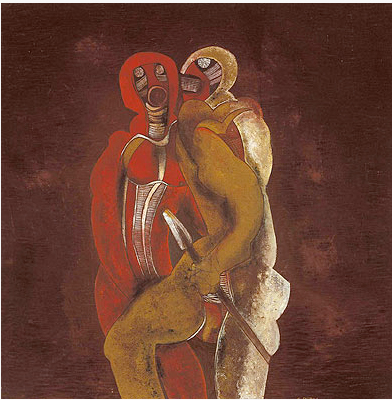
When Skotnes was making the murals for the banks in Johannesburg some of the ‘village dwellers’ managed to ‘break free’. Five joined forces in a composite work entitled The Altar (Pretoria Art Museum). Are they priests, acolytes or worshippers? Or representatives of each of these? Other ‘escapees’ are solitary, like Martyr (Pretoria Art Museum). Collectively Skotnes called such tall, slender works Totem or Totem Figure, thereby once again indicating his fascination with aboriginal (in this case North American Indian) life and art. These images were usually made on planks, worked on both sides so they can stand free and be viewed from both sides. Others were carved from solid wooden beams. Often – like the group of The Altar or Martyr and Totem Figure – single, attenuated figures fill the formats, but others resemble North American totem poles more closely in that a number of images are carved and vividly coloured in a tall, vertical array.
In 1971 Skotnes won a competition to make a mural for the foyer of the Ciba-Geigy office building in Isando, Kempton Park near Johannesburg. Diverse, and what may appear to be unconnected, thoughts crowded his mind when he contemplated the wall. The overriding idea was technical: he would use the big, heavy wooden beams he had recently managed to acquire. The possibilities excited him because he had never used such beams in a mural before. He wanted to set them against black Belgian marble, but when he learnt how expensive that would be, he elected to use precast stone instead. Without hesitation he decided to decorate the beams like totem poles:
And then immediately I thought about Romanesque churches. The round disc at the top is really a rose window – a religious symbol. The three heads were conceived in terms of the architectonic design of the wall in its environment. As was the case with the other murals I took cognisance of the area in which it was set. Placing a religious symbol on it was right, but it wasn’t because I wanted to imbue the chemical company with anything that would make them look as if they were going to church! I just thought it was a good space. ((Cecil Skotnes in conversation with FH, December 1994.))
These reminiscences provide insight into the working of the artist’s rich, eclectic mind. North American totem poles are effortlessly united with Romanesque portals. Without compunction he accepts all religious expression as compatible and all-embracing, arising from universal psychological and spiritual needs. Therefore, totem figures standing sentry in a landscape could just as well be column figures that guard the entrances to medieval churches.
The rose window (or oculus when – as in the Ciba-Geigy mural – it has no radiating design), is an expression of the mandala, a Sanskrit concept meaning magic circle. Skotnes emphasised the reference to Romanesque churches, and in its general appearance the Ciba-Geigy mural is indeed reminiscent of the central part of the western façade of Chartres Cathedral with its oculus below which is a triad of wide, arched windows and beneath them the Royal Portal with its serried columns.
Skotnes understood and appreciated both the Romanesque sense of architectural cohesion and its epic iconography. He would agree with the medievalist, Henri Focillon, who said that the Romanesque artists ‘bestowed super-human proportions on God-made-man and man-in-the-image-of-God; sometimes they even gave them an appearance divorced from humanity’. ((Henri Focillon, The Art of the West, Volume 1: Romanesque Art, Phaidon Press, London, 1963, p.102.)) These were the characteristics Skotnes wanted to redefine in his mural by means of his own imagery.
The designs on the uprights are so abstracted as to be almost non-figurative. Distortions of human figures can, however, be discerned in them (thus recalling both twelfth-century column figures as well as American Indian totem poles), but, prompted by the tall plants the company has placed near them, the shapes can also be interpreted as proliferous vegetation. This, too, is a feature of many Romanesque columns where interlacing vines clamber upwards around the cores. The artist affirmed that he wanted the designs to lead the eye to the culmination point in the oculus.
The three heads recall the triad of windows on the Chartres west front. Unprompted, Skotnes said that these heads were ‘conceived architecturally’, so he may well have been subliminally inspired by the Chartres windows. In the façade the centre window is taller and wider than the lateral two and therefore it appears to be dominant. In the Ciba-Geigy mural Skotnes achieved the same effect by showing the middle head full-face and colouring it white and red – two of the most aggressive colours – while the lateral heads are in profile, each facing the one in the centre. Their colour is mainly a muted, recessive ochre. No wonder, then, that when one is aware of the artist’s reference to religious prototypes, these heads may be interpreted as priests if not divinities.
The disc above is embellished with an intricate design in brilliant red and white against a deep black. The colours in themselves are emotive and over the ages have been given potent symbolic connotations. The shapes are non figurative, but can be read as arcane signs intelligible only to initiates.
To complement the mural, which covers the two storeys of the narrow wall of the foyer, Skotnes made five more works – three small piers and two panels, – to hang in a corridor behind the foyer. Although they are readily visible (in fact, the visitor may see them before noticing the mural which is directly alongside the entrance), these works are remote, but they nonetheless cohere most satisfactorily with the mural and add substantially to the aesthetic quality of this public area of the building.
The Shaka epic
The three stabs of betrayal (by Mhlangane, Dingane and Mbopa) on 22 September 1828 drove into the Zulu earth the subcontinent’s greatest despot – Shaka. But his myth – of the illegitimate weakling of a lowly clan turned warrior, hero, defender, empire builder and god – keeps living on. History and legend here fuse to retell the drama of the people of thunder. ((From the invitation to the exhibition The Assassination of Shaka at the Goodman Gallery, Sandton, October 1973.))
Besides its aesthetically principled formalism, Skotnes’ art also always conveys a psychological, metaphysical, or spiritual message. Sometimes it tells a story. But Skotnes does not merely illustrate the text that inspired him; he recreates it. His pictures are therefore not subservient to the words (as illustrations often are), but complementary works of art that in some cases overtake and overshadow the text. This is true, for instance, of the illustrations he made for Tales, a collection of poems by Sinclair Beiles, in 1972. Instead of visualising the poet’s images, Skotnes recreates the atmosphere of the verse, and the woodcuts can stand independently of the poetry. This independence is even more evident in any illustrations that Skotnes initiated, inspired by what he read or experienced. Such was the case when, in the early seventies, he read E A Ritter’s book Shaka Zulu, ((E A Ritter, Shaka Zulu, Longman, London, 1955.)) the history of a man that was bound to fire the artist’s enthusiasm.
The Shaka epic was visualised after I became acquainted with the main elements of his story. It started as an interest in the man, and became an obsession to give him his rightful place as the most important historical figure of the first half of the nineteenth century. There had been an attempt by both black and white – Dingaan and the British – to smother his importance, to turn him into a vague monster whose impact on the times and the future was equally as vague. I intended to rectify that and present him as the great figure he was. He appealed to me for several reasons: hero in the classical mould, warrior, statesman, ‘creator of the Zulu empire’, tactician and commander. Owing to his action the whole of the tribal life of southern Africa, even as far as the great lakes of central Africa, was redistributed , thus laying the foundations for firstly the white move into the interior and subsequently the establishment of the various presentday black states, but I also wished to maintain the legendary aspects of his character. ((Letter Cecil Skotnes to FH, 19 December 1976. The information in this letter served as basis for an article by FH, ‘Meaning in life, and art’, in Michael Macnamara (ed), Meaning in Life, Ad Denker, Johannesburg, 1977.))
At the time Skotnes was reading Ritter’s book, Vittorio Meneghelli showed him a magnificent old door of heavy, solid wood, divided into 47 small panels. Meneghelli, an art collector who counted many artists among his friends, told Skotnes that he wanted to ask several of them to decorate a panel each, including Skotnes. Skotnes’ response was to say emphatically that nobody else but he was to touch that door. He carved Shaka’s story on it. The complete work is, he said, ‘a direct interpretation of Shaka’s life, each panel or incident made in historical sequence, and overall it was slanted towards the hero figure.’ ((Letter Cecil Skotnes to FH, 19 December 1976.))
Skotnes regards this door as a ‘block book’, that is, a story told in pictures without words. His models were medieval and Japanese block books and, above all the twentieth-century example made by Frans Masereel, the Belgian Expressionist woodcutter who cut in block prints his indictment of the social upheaval of the twenties. After completing the door, Skotnes remained engrossed in the Shaka theme.
I was totally absorbed by the man and loved him as I probed his story. He seemed to laugh at civilization as we know it. He indicated that the new Africa would take what it wanted from our world and use it for its own purposes. He after all set in motion everything that besets civilization here and now. The idea was SHAKA, and Shaka became the giant that set in motion the force – the winds of change – that will destroy the world as we know it, the world we already doubt. It was like the Norsemen in Europe. ((Quoted in Denis Godfrey, ‘Shaka comes to life’, The Star, 20 October 1973.))
Therefore he suggested to a friend, poet Stephen Gray, that together they should make a block book in the form of a portfolio with images and words. ‘We did an enormous amount of research, and actually travelled the route from Shaka’s birthplace to his Great Kraal,’ Skotnes told Denis Godfrey. He worked on the project for almost fifteen months, making drawings, watercolours and the 150 blocks needed for printing. Concurrently he also made large panels depicting characters from the saga. One of these, U Shaka (or Shaka the God) (Pretoria Art Museum), was completed in December 1972. The artist still considers this panel to be the best in the Shaka series.
On 20 October 1973 the portfolio, The Assassination of Shaka, was exhibited at the Goodman Gallery, Sandton, and, despite some negative criticism, caused a sensation. ((The Shaka epic as visualised by Skotnes elicited enthusiastic publicity. A selection of articles is given here: Lin Menge, ‘Shaka dies again … ‘, Rand Daily Mail, 19 October 1973; Denis Godfrey, ‘Shaka comes to life’, The Star, 20 October 1973; John Dewar, ‘The Assassination of Shaka’, The Star, 29 October 1973; Valerie Rosenberg, ‘The Assassination of Shaka’, SA Panorama, February 1974; Jenny Basson, ‘The Assassination of Shaka’, Artlook, April 1974. Some critics, however, had reservations: Bonnita Davidtsz, ‘Tsjaka-verhaal in houtsnee teleurstellend’, Die Vaderland, 24 Oktober 1973; Nico van Rensburg, ‘Cecil Skotnes se houtsneë te maklik”‘, Die Transvaler, 26 Oktober 1973.)) The 225 available copies were sold on opening night. Disappointed collectors and bibliophiles had to wait until the following year when McGraw-Hill published the portfolio as a standard book. ((Cecil Skotnes and Stephen Gray, The Assassination of Shaka, McGraw-Hill, Johannesburg, 1974.)) At the time of the exhibition Skotnes said:
I don’t think anything as big as this has been done here before, and it is debatable whether an epic story of these proportions has ever been done in woodcuts and poetry in this country. Because of the medieval character of the woodblock technique and the use of free verse, we get down to fundamentals, which is what Shaka was – a fundamental figure in southern Africa’s history.
His is, in fact, an epic of all Africa. Shaka matches the great mythological figures of the ancient world in every aspect of his life, and thus, in less than 150 years, we have a figure of this stature on the horizon of our history. ((Quoted in Denis Godfrey, ‘Shaka comes to life’, The Star, 20 October 1973.))
In April 1974 Skotnes donated an incised painting of the Zulu hero, as well as some of the blocks used to make the prints in the portfolio, (( The blocks used for the making of The Assassination of Shaka that were donated to the Touch Gallery: 1. The forging of the stabbing spear, red block; 2. Dingiswayo dies, black block; 3. Festival of the first fruits, brown and black block; 4. Shaka’s bath, three-block printing process: brown, yellow, and black blocks. ‘The Touch Gallery no longer exists, having become the Annexe Gallery, a space designed to accommodate exhibitions with an educational character, although this is not hard and fast. The Shaka blocks are now in the Education Collection which comprises all the work from the old Touch Gallery Collection plus additions.’ Emile Maurice, Education Officer, South African National Gallery, letter to FH, 4 April 1995.)) to the recently established Touch Gallery in the annexe to the South African National Gallery in Cape Town. In her letter of acknowledgment the curator of the gallery wrote:
It is exciting to see sighted visitors, fresh from the Assassination series in the main gallery, entranced by the opportunity of being able to appreciate your approach through a tactile sense. The blind have responded eagerly, too, and suddenly realise why their practical sessions have revolved around a two-dimensional approach. People who might otherwise not have heard of the Touch Gallery are now interested in the set-up as a whole. ((Letter from Sandra Eastwood, Curator of the Touch Gallery, Cape Town to Cecil Skotnes, 17 April 1974.))
The Cape Times placed a photograph of a blind visitor from Guguletu discovering the image on the large panel, and recorded her response: ‘It has a head – arms – legs, they’re pointed, like assegais! He has no feet.’ The expression on her face changed from a frown to a gleam of delight as she began to perceive the form on the wood. ((Letter from Sandra Eastwood, Curator of the Touch Gallery, Cape Town to Cecil Skotnes, 17 April1974.))
On 10 May 1974 the artist and poet went to Nongoma to give a portfolio to the Zulu people. It was received by King Goodwill Zwelithini at a splendid ceremony. In closing Chief Mangosothu Buthelezi called
… his venerable aunt, oldest female praise-singer of the house of Senzangakona, father of the Shakan dynasty. And she, eyes closed, body clenched, had us stand; and she launched into a rhetorical display that tape-recorders and movies and books don’t seem to have caught – a living, virtuoso, magnificently-controlled, tense, praise-chant, and a full-spate, musical battering of words as codified history, as epic drama, as celebration, with the praises of Senzangakona … ‘Bayete! Bayete!‘ ((Stephen Gray, from the English original for an article in Rapport, Foto bylae, pp.4-11 , 28 July 1974. On page 4 is a photograph of the female praise-singer in action.))
The heroic Zulu continued to haunt Skotnes. In May 1974 the Goodman Gallery presented an exhibition comprising thirteen incised paintings, some of them very large, and fourteen drawings and watercolours that reiterated the Shaka theme.
One of the large works, a triptych, The Death of Shaka, was commissioned by the South African National Gallery. The carving of the blocks was preceded by sketches in watercolour (South African National Gallery) that contain the fury and violence of innate savagery. The completed panels are more controlled, the emotions harnessed, so to speak, within the confines of surface design.
Artistically Skotnes had exhausted the theme, but the art world still clamoured to see it. As a result an exhibition of Zulu artefacts was shown in Vienna with The Assassination of Shaka as its centrepiece. Cecil Skotnes was invited to attend the opening and to address the visitors. Crowds came to see and to learn. News of the exhibition spread resulting in museums in Germany, France, Monaco and Belgium asking to show it, too. Europe’s artistic eye (as opposed to its hostile political eye) was suddenly focused on the sub-continent and Skotnes acted as South Africa’s cultural ambassador.
Borne along by the success of The Assassination of Shaka Skotnes and Gray were inspired to make more block books, albeit on a less ambitious scale. The White Monday Disaster, telling the story of Wolraad Woltemade, and Baudelaire’s Voyage to the Cape followed in quick succession. Concurrently with Baudelaire’s Voyage Skotnes made ten coloured woodcuts to illustrate poems of his deceased friend, Charles Eglington. ((For White Monday Disaster see Stephen Gray, ‘White Monday block book’, Artlook, August-September 1975; Lin Menge, ‘White Monday Disaster’, Rand Daily Mail, 15 February 1975; Jenny Basson, ‘Houtsneë gedenk heldedaad’, SA Panorama, June 1975; Dina Katz, ‘Cecil Skotnes- new directions’, Artlook, April 1975, p.23; ‘One man and his horse – 200 drowning people’, Sunday Times, 16 February 1975; Denis Godfry, ‘Skotnes a sell-out’, The Star, 21 March 1975. For Baudelaire’s Voyage see Beeld, 1 November 1975; Richard Cheales, ‘A voyage into the past’, The Star, 13 December 1975. For In Memoriam Charles Eglington see John Dewar, ‘The shape of poetry’, The Star, 8 October 1975; Richard Cheales, ‘Mystic verse gets virile treatment’, The Star, 12 December 1975.))
Since all the portfolios and the McGraw-Hill publication of The Assassination of Shaka had generated unprecedented profits, artist and poet undertook to plough back some of the proceeds into a publishing venture, the Quagga Press. It would concentrate on the reissuing of key works of South African fiction, beginning with the republication in 1975 of Mhudi, the first English novel by a black author, Sol T Plaatje, written in about 1917. Skotnes made the woodcut illustrations for it. ((Sol T Plaatje Mhudi, introduction Tim Couzens, woodcuts Cecil Skotnes; African Fiction Library, general editor Stephen Gray. Number one in the series, Quagga Press, Johannesburg, 1975.)) The publishers obtained the rights to produce other titles, but after the appearance of Mhudi, the Quagga Press amalgamated with another firm, thereby conceding its imprint.
The Underground
beneath a hill of human bones
a swaddled group
laments and groans.
one dares to cry he’s crucified
what answer can he get from
relatives who died
and gardened him below
as if some seed to sow?
whate’er his breed
man is not seed
begins to sing the underground
and there’s a tremor in the earth
at this frightening sound.
how will they rise from out their grave
and standing on the hill of bones
how will they behave?o do not ask
one thing we know
they will not show.– Sinclair Beiles ((Poem written for Cecil Skotnes in 1975 after the poet had seen the paintings Visit to a Battle Site.))
Visit to a Battle Site 3
After the tumult of the Shaka experience which took the art world by storm, Skotnes felt artistically drained, and he craved silence. He found it in his memories of the desolate battlefield of Isandhlwana in Natal. He was sensitive to its eerie stillness, and aware of the souls that haunted it. He said that the battle site paintings grew out of his whole spiritual vision.
Visit to a Battle Site 1
I attempted to create the silences. The silences I sense when I stand in front of the Piero [della Francesca] Christ Rising from the Tomb or the Duccio Maesta in Siena, and The Charioteer of Delphi. The battle site was lsandhlwana in Natal, but it could have been any monument to man’s folly. After all I have strode over battlefields when the smoke was still all-embracing and the roar of guns is still in my ears. There is a religion in silence – the stillness is a wilderness and that term wilderness is loaded with tradition – the great wastes on which a whole generation of slave Israelites died out, even their leader Moses, so that only those who knew nothing but victory would inherit the new world. The battle site pictures are really an attempt to put all the elements of my artistic output into single compositions. That, of course, failed, but the fragments were larger and therefore more lucid. After great noise the silence is almost unbearable – it is the mind and spirit summing up the causes of the cataclysm, and those who pause to understand usually never survive. They are the spirits of reason, and our times, while taking cognisance of reasons, never indulge in reason. The creative souls can and usually do quickly sense the times and are usually first to set down their reactions. Also at the moment of conception there is no fear. Those figures on the battle site are not the ghosts of dead men – they are the understanding of what is to occur or the wilderness created by storm. ((Letter Cecil Skotnes to FH, 19 December 1976.)) The silence of the battle site lets the spirits live again. ((Cecil Skotnes reminiscing with FH, 26 August 1994.))
Visit to a Battle Site 7
I made several pilgrimages to lsandhlwana, the great battle site where the Zulus destroyed a British army in 1879, before even thinking of attempting to depict the site. When I was preparing for The Assassination of Shaka portfolio Stephen Gray, Thelma and I were taken to the site by the Reverend Anthony Barker, a doctor missionary at a local hospital. It was a deadly quiet warm day which heightened the long-ago dreadful sound of battle and the protests of the 4 000 dead who must surely still roam that broken plain. The white stone cairns which straddle the place, showing where each English regiment died in defence of a dubious cause and the lack of any visual funeral artefacts to honour the Zulu dead. I’ve read almost everything about that conflict, mainly official documentation. However, I have an addiction to battle sites. They were burnt into my consciousness in a dozen or more places in northern Italy before I became a painter, and the awesome results of war are so easy to recall, especially in those hours before dawn breaks. ((Letter from Cecil Skotnes to FH, 26 January 1994.))
The battle site pictures were exhibited at the Goodman Gallery in Sandton in 1975. They inspired the critics, and therefore some of the reviews are reproduced here with no further commentary since they recreate the general response – even today – to these intensely personal works.
Visit to a Battle Site 14
‘Paintings on a visit to a battle site’ reflect the remarkable spiritual effect that a visit to such a site as lsandhlwana induces – for although he doesn’t publish the scene of his experience , that is where he found his inspiration. Skotnes has conveyed the supreme loneliness of the place, the utter quiet and above all the presence of an invisible host – the men who died and are buried beneath the white-washed stones. I have visited this famous battlefield on several occasions and I have remarked on the complete absence of sound, even of the crickets which are so characteristic of the veld. All this is present in these superb paintings. They are abstractions with an element of realism and they would make a splendid mural for any memorial on the site, one which I think anybody would understand’.
HE Winder
Rand Daily Mail, 14 March 1975
Visit to a Battle Site 12
Cecil Skotnes is an artist with a special affinity for Africa and he has found fruitful means of expression through rediscovering aspects of its heroic past. The spirit of Africa pervades his work and history becomes art in his latest series of paintings … These large canvases are the artist’s response to the scene of the battle of lsandlhwana in 1879. Entitled Visit to a Battle Site, the paintings do not tell a story but consist of figures set in different metaphysical landscapes – timeless figures which speak of the blood, isolation and misery of war. There are faces which ask questions about glory, victory and honour. Skotnes visited the battle site during the course of the research for his portfolio The Assassination of Shaka. He was struck by the fact that although there were cairns of stones for the British dead, nothing marked the graves of the Zulu warriors. Three thousand Zulus died in this, their last successful onslaught before final defeat. Their heroism is not recorded for posterity. What is remembered is that the Zulu King gave permission for the people to weep in the villages despite their victory. This is what moved the artist. ‘The echo is so relevant to the times in which we live,’ he said.
Natalie Knight
The Star, 7 March 1975
Visit to a Battle Site 13
These sombre and dramatic paintings with their half life-size figures boldly assert their presence and power while recording his visit to the site of the Battle of lsandhlwana of 1879. Here Cecil’s deep interest in the Zulu nation … is extended and encapsulated into a statement of profound significance. Making an immediate impact on the senses, each painting asserts itself through the masterly handling of rough, earthy textures united with the subtlest of ochres, pinks and blacks – all alive with atmosphere. The visual idea of the figures encompassed and enclosed by the high horizon strongly suggests living forms becoming living spirits – lingering for eternity at this sight of blood and momentary triumph. A grave indeed for brave Britons and Zulus who died for a forgotten cause, but somehow still relevant as we, nearly one hundred years later, struggle to live together in peace, harmony, and goodwill.
Larry Scully
Sunday Express, 9 March 1975
Visit to a Battle Site 8
Skilderye oor ‘n besoek aan ‘n slagveld boei nie net onmiddellik nie, maar laat ‘n mens ook met ‘n gevoel van aangename verrassing. In hierdie lien skilderye bereik die kunstenaar, wat met sy houtsnee en gekleurde houtpanele bekend geword het, waarskynlik vir die eerste keer ‘n hoogtepunt in die skilderkuns. Die grootste lof wat ‘n mens die skilderye kan toeswaai, is dat hulle geen geskilderde houtsnee is nie, maar skilderye in hulle eie, skilderkunstige reg. En dat nie almal van hulle dit is nie, is bloot ‘n bewys van die ontsaglike stilistiese stryd wat die kunstenaar in die oliemedium moes voer, asook van die verdienstelikheid van sy uiteindelike oplossings. Die drie skildrye [No.4 , 1.36, No.5, 1.37 and No.7, 1.31] wat as skilderye – nie heeltemaal wil slaag nie hang ook in ‘n afsonderlike vertrek. Hulle is waarskynlik die vroegste geskilder, want hier vind die kunstenaar dit nog duidelik moeilik om die grafiese stilering van sy houtpanele aan te pas by die meer ruimtelike, atmosferiese medium van die skilderkuns. Die doek van die skildery is nog benader soos die tweedimensionele oppervlak van ‘n houtpaneel. Ruimtelike diepte ontbreek en die stormagtig e, gejaagde kleurgebruik verraai Skotnes se onsekere soektog om dimensie langs die weg te bereik. Die poging tot ekspressiewe diepte in die wolkerige kleur word egter gefnuik deur die houterige liniere strakheid van die figure wat almal in een statiese vlak langs mekaar ingeskets is. Skotnes maak self ‘n byna wanhopige verwysing na die dominering van die houtsneestyl in hierdie werke wanneer hier en daar hy ‘n figuur uit hout gekerf tussen die geskilderdes monteer. Dit verteenwoordig ‘n onsuksesvolle poging om deur middel van fisieke relief en kontras ‘n effek van ruimtelike diepte te bereik. In No.8 is dit asof Skotnes ‘n keerpunt bereik en die stilistiese oplossing in sig het. Die oplossing is grootliks gebaseer op ‘n meer oortuigende gebruik van ruimtelike en kleurperspektief. Die figure is nie meer in ‘n enkele vlak vasgeknel nie. Kleintjies staan agter en groteres voor om ruimtelike diepte aan te dui. Hulle is nou ook nie meer net liniere raamwerke nie, maar meer bevredigend opgebou deur middel van kleurkontraste. Hier is ook nog ‘n uit hout gesnyde figuur gemonteer, maar hier werk dit beter perspektief gebruik mee om die skerpheid daarvan meer aanvaarbaar te maak, aangesien die figuur illusioner nader aan die aanskouer staan as die ander. Daar is nog ‘n mate van ruimtelike en komposisionele onsekerheid in hierdie werk, maar dit verdwyn in die res van die skildrye. Kleurvlakke word by hulle omlynings subtiel vervaag om die indruk van linieriteit op die agtergrond te stoat. Die omgewing waarin die figure staan is nou met ‘n gesofistikeerde aanvoeling vir geskilderde ruimte aangetoon. Die invloed van die houtsnee is nog merkbaar in die abstrakte vereenvoudiging van die figure en die landskap, maar dit het nou ‘n positiewe uitwerking. Die vereenvoudiging laat nie die soliditeit van die figure verlore gaan nie, maar gee aan hulle ‘n gevoel van indrukwekkende monumentaliteit en terselfdertyd ook, soms, stille bewoenheid.
Johan Bruwer
Beeld, 17 March 1975
The precursor to the Visit to a Battle Site series is a painting entitled Independence, which Skotnes completed for Finans Bank on 2 January 1974. It is an arid, desolate landscape, but great gatherings of spectral populations are suggested within its rocks. A solitary figure, engraved upon a piece of wood, is superimposed on the painted surface. In response to the patron’s request, Skotnes explained how he had endeavoured to express independence in this work:
The original theme of ‘Independence’ was to me the independent man – man who, in spite of his environment, stands like a pylon. The use of the pylon theme throughout history was a symbol of fertility – intellectual fertility as well as physical fertility, for example the great hero figures who seem to grow out of their physical environment and yet somehow stand apart from it. They become the catalyst of their times in which all things, good and bad, are embodied. Hence when I constructed my painting I used a quite forbidding landscape and placed my pylon in the midst of it in a different material. Naturally the forms I used were in spirit, I think, African, and though it is a small touch I used stinkwood as my pylon as it is our most celebrated wood. ((Cecil Skotnes, caption for the illustration of Independence, Finans Bank Annual Report, 1983.))
The Visit to a Battle Site pictures which followed were created in a more contemplative mood and became more painterly and mystic as the series progressed. His interest in wood engraving and cutting is evident not only in the harshly delineated forms that define the plain and the horizon of the battlefield, but also in the wooden figures attached to the surfaces of the paintings.
Skotnes completed several pictures in this hybrid style. Then, while working on No.8, his dormant painterly intuition banished the graphic artist and woodcarver in favour of the painter. Even though a cut-out wooden figure is still attached to this picture, softly painted figures encroach upon it, and seem to threaten its place in the field. The hills on the horizon (which remained virtually untouched in the reworking) retain the delicate network of lines, but they are no longer as pronounced as in some of the other panels.
Having tasted this new freedom, and having discovered an evocativeness with the potential to communicate the mystic ambience he had experienced at the site, Skotnes turned to the completed panels that were awaiting exhibition. The first one he felt compelled to change, No.3, was, in fact, sold. But he was now so convinced of his new vision that he could not tolerate the original concept. He removed the attached carving and repainted the remaining figures entirely on a silvery grey background. Only a fragment of the hills on the horizon remained as it had been in the original version. He continued to rework the other paintings and to begin new ones: ‘They grew out of the picture [i.e. No.3] that is underneath your picture [i.e No. 9],’ he wrote to the owner, ‘that obliterated work was the key to the series.’ ((Letter Cecil Skotnes to FH, 19 December 1976.))
No.2, underwent a similar change. The ‘new’ work (No.10) is now in the Pretoria Art Museum, while No.6 was repainted to become No. 11, now in the Sanlam Collection.
A few years after completing the Visit to a Battle Site series, Natal and the history of the Zulus were to call upon the artist yet again. In 1979 he was responsible for the decoration of the Ulundi Holiday Inn. He designed the wall hangings and made large incised paintings to embellish doors and the reception counter. On the wall dividing the dining area from the kitchen he made a decorative sgraffito mural featuring a still life and a huge cockerel. But the major work is a sgraffito mural in the conference room portraying the militant history of the Zulu people.
Consolidation and continuation
Skotnes was restless after the success of Shaka. His output remained as prolific as ever, and the public’s adulation – expressed in feverish acquisition of his work – did not wane. Objective as ever, he became aware of the signals that could lead to artistic disaster. To avert this he attempted a – for him – radical change in style. Change was already evident in the largely intuitive paintings of Visit to a Battle Site as well as in ten woodcut landscapes which had a greater fluidity of line and a more evocative use of colour than his earlier work. Large incised paintings of tragic human beings and anguished heads were shown in 1976. The previous aggressive linearity was softened in these images. The compositions were given greater atmospheric depth. These introspective, sombre works evoke an almost macabre intimacy in the way their organic shading approaches the softness of flesh in the hard medium of wood. It would seem that in these panels Skotnes replaced the former stylised figures with sensual human beings. The artist seemed to be moving from abstract to more naturalistic portrayals; from flat to modelled; and, emotionally, from detached to distraught.
Despite this inclination to a more three-dimensional depiction of the forms in the 1976 panels, the 1977 exhibition of nine free-standing sculptures was a surprise. Skotnes, however, regarded it as a logical step. ‘After all these years of working on the flat with wood I just had to go for the three-dimensional experience.’ He even ‘went to a professional mason for a few months to learn the technique [of stone carving], and now I emerge covered in stone dust in the ancient tradition of sculpture’. ((Cecil Skotnes speaking to Percy Baneshik, The Star, 23 September 1977.)) But the fact that he exhibited only one stone carving indicates that he still felt a greater affinity for wood.
This exhibition of sculpture betrayed, I believe, the artistic crisis Skotnes was trying to resolve. Johan Bruwer, one of the most perceptive critics, regarded it as a major and positive rejuvenation of the artist’s work. He went on to say that the creation of these nine carvings (some of them large, and all completed within six months) must have been profoundly therapeutic for the artist and a rediscovery of the basic roots of the creative process which he could develop profitably into fresh forms of expression. ((Johan Bruwer, “n Hergeboorte vir Cecil Skotnes’, Beeld, 29 September 1977. Freely translated by FH.))
Immediately after completing the sculptures Skotnes made The Origin of Wine ((The Origin of Wine may have been the title given to the work by the KWV. It would be more correct to call it The History of Wine or An Ode to Wine. Skotnes called it ‘wood panel on epic of Gilgamesh’ (see Curriculum Vitae) which it patently is not since only the first panel refers to Gilgamesh.)) for the Cape Wine Growers Association (KWV). In this, the renewal predicted by Bruwer as well as consolidation of earlier work and a regained peace of mind are evident. The side panels of the triptych are embellished with delicate line engravings: a still life with fruit, fish, bottles and glasses on the left, and workers in a vineyard on the right. The central, vividly coloured panel tells the history of wine. It begins with a quotation in Sanskrit from the epos of Gilgamesh which is perhaps the oldest extant description of a vineyard. Many of the following episodes were gleaned from an illustrated book about the history of wine from the earliest times, and further scenes, several also derived from visual prototypes, illustrate the wine industry in South Africa. Skotnes drew upon his own previous work, too, such as the Shaka, Wolraad Woltemade and Baudelaire block books.
The triptych unashamedly divulges the artist’s epicurean gastronomic pleasures. Not only is this displayed in Wine at Groot Constantia (and the same enjoyment radiates from his large still life painting that hangs in Laborie’s entrance hall), but also in the opulent Viva France in which a rooster ostensibly symbolises France, but which Skotnes also clearly sees as a source for a delectable dish to be accompanied by a noble, preferably deep red, wine.
Above all else, however, The Origin of Wine exudes Skotnes’s delight in the act of artistic creation. Always the meticulous craftsman and disciplined designer working according to formalist principles, he here relaxes somewhat to allow intuition and the natural rhythms of his hand free rein.
Stylistically The Origin of Wine signals a turning point in his career. The triptych is much gentler and more lyrical than his previous work. Its images are contemplative and intimate rather than heroic and autocratic, the execution is delicate rather than robust and the colours are luminous rather than aggressive. In contrast to his previous angst-ridden work, and in particular the anguished panels of 1976, The Origin of Wine exudes a feeling of quietude.
The triptych, made in the year before Skotnes finally moved to Cape Town after much soul-searching, indecision and several exploratory sojourns in the Cape, stands as a watershed in his artistic career. While his groping for renewal during the preceding years had been triggered by the fear that he was stagnating creatively and that his work was becoming repetitive, he overcame this fear in the triptych.
Once he had settled in Cape Town he felt liberated. The change in his style is subtle, but decisive. Like the Johannesburg period the Cape period began with a series of imaginative landscapes which he called, significantly, Passage Through an Alien Land (1980-81). This was followed in 1982 by a series of larger paintings of the Cape winelands. Besides form, shape and pattern, light, atmosphere and colour inspired the artist now and this enabled him to come closer to his ideal of painting spiritual landscape. When he visited Jerusalem in 1982 he incorporated figures into a mystical setting in a series called Judaean Walls, and the theme gradually evolved into incised paintings called Figures in a Metaphysical Landscape. The largest of these was made for the Groote Schuur Hospital in 1990.
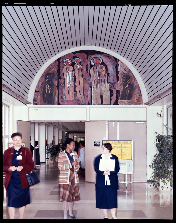
Large tragic nudes and monumental heads also reappeared. They had become ‘visceral, touching deeply inward feelings. Sometimes the figures literally appear to be cut open, disembowelled, the emotions themselves spilling out in a scream of pain and anguish’. ((AJ Werth, Introduction to Villa Skotnes, catalogue of the exhibition held at the Pretoria Art Museum and the Goodman Gallery, Sandton, 1989.)) In contrast are delicately-crafted icons in memory of historical heroes. A joyful tribute to flight commemorated South African Airways’ 50th year in 1984, and Homage to Reading and Printing was made for the public library at Kimberley in the following year.
1820 Settlers
In October 1984 the Commemoration Committee of the 1820 Foundation mooted that, to mark the tenth anniversary of the working life of the Monument in Grahamstown, its somewhat bare interior should be embellished with works of art. Tapestries or paintings ranged along the walls of the Fountain Area were considered, but it was ultimately agreed that Cecil Skotnes should be commissioned to make sixteen large panels (later there were to be 24) featuring the Settlers’ arrival, living conditions and their contribution to the development of South Africa. Detailed historical realism, which some Council members favoured, was rejected. Instead the complex work, consisting of four vertical surfaces, each containing six panels, and mounted around a fountain, would ‘present, in bold symbolic manner, the dynamic nature of the British-speaking experience in Africa, from the settlement to their current involvement in the creation of a common society in which African and European elements will blend – as in Skotnes’s distinctive work’. ((From extensive notes on the 1820 Settler Panels written by Professor Guy Butler for FH, January 1995. Additional information was gleaned from Minutes of Council Meetings and news clippings assembled for this essay by Shelagh Blackman, Media Manager of the Grahamstown Foundation.))
Skotnes was eager to begin this enormous undertaking – the area to be covered was approximately fifty square metres – and on 26 November 1984 he posted a roll of drawings to Guy Butler. These included:
… intitial sketches, some with colour and some without, and an entire lay-out sheet of small drawings covering my first thoughts on the theme. The drawings on the main sheet are, I think, a clear enough indication of the way in which I would develop my ideas, but as I marshall those ideas and bring the final lay-out to fruition there would be a great deal of simplification and abstraction of the whole. Some of the drawings seem to me to be a good indication of their final appearance whereas many of them are, as yet, unformed and a little too representational. As I said from the start, the human figure seems to me the most eloquent way with which to express both the symbolism and the themes. This initial lay-out is without a final form and the gaps are not sufficiently bridged – a few hundred drawings from now would see a better result. ((Letter, 26 November 1984, from Cecil Skotnes to Professor Guy Butler who kindly sent a copy to FH.))
Despite some councillors’ uneasiness about the historical perspective presented and the non-realist, symbolical style, the reactions to Skotnes’s proposals were favourable. Further discussions with the architect, Jock Sturrock, artistic advisor, Robert Brooks, and Guy Butler followed before Skotnes began making the panels. In the Council Meeting Minutes of 25 April1986 it was noted ‘the Skotnes panels arrived last week’. The entire work, from the first drawings in November 1984 to the final panel, had been completed in seventeen months. The murals were unveiled by Dr Ian Mackenzie, President of the 1820 Foundation, during a sumptuous, televised function on 27 June 1986.
The grouping of the panels evokes the year’s four seasons which symbolise the great on-going cycle of decay and regeneration. The first six, recalling the devastation of pre-1820 wars in Europe and South Africa, are a metaphor for autumn and winter. The next six, The Frontier, refer to spring and indicate a new beginning for both the white and black peoples. The third group, Towards a New Society, is summer, a time when all will work in harmony and have equal rights. And, thanks to the allegorical summer, the people may, through the creative spirit as it is expressed in the various arts, experience an idealistic vision of unity and freedom.
The founders and patrons of the 1820 Settler Monument had always advocated equality, unity and co-operation of all South African peoples. They rejected memorials to specific battles and heroes. They advocated rather what may appear to be a contradiction in terms: a memorial to the future. They did not want to deny the past, but neither did they want to dwell on it.
Of course frontier history was a fact which could not be wished away; but one did not need to erect permanent reminders of its wars. Grass grows quickly on a battlefield but anyone who thinks, for instance, that the allocation of land in the Eastern Cape has been finally ‘settled’ has simply not been aware of the redistribution demands of the past two decades. ((Guy Butler, A Local Habitation, Vol.3 of autobiography, 1945-1990, David Philip, Cape Town, 1991 , p.297-8. Chapter 24, ‘Monuments and festivals’, provides background to the Monument and the ideals set by the 1820 Foundation.))
When Skotnes was asked to make the panels it was understood that he, too, would think in this vein. Since such thinking was identical to his own he found no difficulty in creating parallels to emphasise the equality of the various peoples who were involved in the saga, and, being an idealist, to envisage a utopian future. Except for the African’s ox and the European’s horse, the parallels are not patently obvious. This ambiguity endorses the sense of desirable unity. ‘African’ and ‘European’ scenes alternate. Sometimes it is impossible to tell which racial group is featured because they are already united. Except in Group A, which deals with the period when the two groups lived on different continents, the episodes are frequently fused visually by the continuation of the landscape, or by compositional lines and shapes. In its visual and iconographic entirety, therefore, the 1820 Settlers mural is a great political statement of a fervent humanitarian. Simultaneously it transcends the political issues of the time and stands for universal ideals.
As for the symbolic treatment of the Settler saga: it has the enormous advantage of not being a visual reminder of the colonial past. Its treatment makes it possible to turn many historical episodes into contemporary and continuing allegories. We are still faced with hunger and political exploitation; with different life styles, racial tensions and conflict; the hunger for justice and the fruits of the earth has not ceased. The ‘Settler Saga’ is treated in a way which invites us to see it as a parable of the human condition. ((Guy Butler, ‘Notes on the Skotnes Murals’, June 1986.))
Predictably the panels caused controversy, some people responding enthusiastically, others with dismay. After a fire that gutted a large part of the Monument on 13 August 1994 a few conservative citizens expressed the hope that the murals had been destroyed. They survived, although damaged by smoke. Skotnes himself restored them, and they are once again in place. As Guy Butler says, they are ‘powerful works in keeping with the monumental volume and enhancing it; their colour alone enriches and enlivens the visual impact of the building like interior stained glass’.
Consistency in variety
Cecil Skotnes is known primarily for his woodcuts and incised painted panels. But throughout his career he has also worked in other media: pencil and chalk, watercolour, oil and acrylic. He gouged designs into plastered walls, calling this sgraffito, and very occasionally he worked in ceramic. He also made a considerable contribution to the art of tapestry.
In 1961 Coral Stephens, a weaver from Swaziland, saw a Skotnes panel at the Egon Guenther Gallery which she dearly wished to own. Skotnes said she could have it in exchange for a tapestry woven from the design. A delighted Coral proposed that her daugher, Marguerite, who had shortly before qualified as an occupational therapist, should undertake the task. This was the first tapestry Maguerite had ever attempted and it marked the first of many collaborative works with Cecil Skotnes as well as the beginning of an illustrious career as a tapestry weaver.
In 1964 Mr W Marshall Clark, Chairman of the Swaziland Iron Ore Development Company, commissioned the duo to make a tapestry as a gift for the Japanese owners of an ore-carrying freighter. Skotnes incorporated two of his favourite themes, landscape and heads redolent with symbolism, in the design. Three interflowing panels, in bright reds and ochres offset against neutral greys, fuse to symbolise the iron ore trade which linked Swaziland with Japan. On the left is the iron ore mountain in Swaziland and the railway leading to the sea. In the middle two joined masks, one Japanese, the other African, represent the two countries. And on the right is the sun rising behind the industrial buildings of Japan.
The largest Skotnes and Stephens venture was the hanging (427 x 340 cm) they made in the mid-sixties for the President Hotel in Johannesburg. This African landscape featuring rocks, succulents and spiky, twisted trees was hung behind a chest carved by Skotnes with angular, black figures. ((When the President Hotel was closed in 1981 the works of art were sold by Sotheby’s. The tapestry and chest were bought by a private collector and placed in his home in Rustenburg.))
Marguerite Stephens made many more tapestries from Skotnes designs. Several of them were created specifically to be woven, but frequently Stephens selected existent panels or woodcuts and translated them into wool.
In 1966 Skotnes was invited to enter a competition to find suitable designs for tapestries to embellish the Ernest Oppenheimer Theatre in Welkom. The competition generated sufficient interest for a Cape Town newspaper to place a lengthy report giving interesting details:
The impetus behind the competition came from the architect (Jack Barnett of Cape Town), who with the help of a board of assessors consisting of a gallery director, an art critic and the Mayor representing the Council, framed the conditions for what has probably been one of the best organised and most efficiently run ventures of its kind. Six artists, chosen for their ability to work on the broad scale that tapestry demands, were invited to submit cartoons. These were: Eleanor Esmonde-White and May Hillhouse of Cape Town, Eben van der Merwe of Bloemfontein, and Cecil Skotnes, Cecily Sash and Anna Vorster from the North. The contestants were supplied with a complete set of documents allowing them to gauge the architectural character and colour scheme of the interior volume in which the winning work would be seen. They were given the titles Gold and Diamonds as thematic pegs for each design. No restrictions, however, were laid down as to style. As things turned out the standard of the entries received fully justified the careful planning that had gone into the project, and the choice confronting the judges was an extraordinarily difficult one – the entries of Cecil Skotnes and Eleanor Esmonde-White making particularly strong claim. In the event the main award was given to Miss Eleanor Esmonde-White … The entries of Cecil Skotnes were marked by a more abstract handling of the ‘themes’, and were sharply differentiated in character from Miss Esmonde-White’s more figurative approach. In acknowledgment of the particularly high standard Skotnes achieved in his Gold theme the original framework of the competition was extended to allow his work to be placed in the building as well. ((Neville Dubow; ‘Welkom Tapestry Competition’, Cape Argus, 14 June 1966.))
The winning designs were woven in Aubusson. The completed works were shown in the Johannesburg Art Gallery together with an exhibition of contemporary French tapestries in November 1967 before being placed in their permanent positions in the theatre.
In 1971 Egon Guenther commissioned Skotnes to make designs for four tapestries to be woven in Portugal by Fino-Manufactore de Tapecaries. The first Skotnes adapted from a 1969 coloured woodcut, but the others he painted in gouache specifically to be woven.
The Skotnes tapestries provide a summary of his iconography and style. In them are the distinctive figures and mask-like heads, drought-stunted vegetation and panoramic views of veld, mountains and sky. Where most of them differ from his panels and woodcuts is in the adaptation of colour to suit a medium which is more lush and pliable than resistant wood.
A consistent characteristic of Skotnes’s art is its integrity, but its seriousness does not preclude humour and, not infrequently, playfulness. Sometimes, indeed, when in a jovial mood, he will create an entire collection of ‘fun works’ such as the cut-out classical gods and goddesses exhibited at the Totem Meneghelli Gallery, Johannesburg, in 1971. ((Icons. Totem Meneghelli Gallery, November. See The Star, 18 November 1971, Artlook 62, January 1972.)) Time and again he participates in fun events for charity such as constructing a kite ‘to promote friendship among the children of the world’. ((The kite, made in 1972, displayed a tribal mask motif in white, black, yellow and red. It had a bird crest and fish tail. More than 100 countries were asked to exhibit kites designed and built by prominent national artists. They were displayed on International Children’s Day in Virginia and later auctioned in the USA. Skotnes remembers that the kite took him a nerve-wracking two weeks to build.)) He has designed and printed posters for theatrical productions or idealistic causes which were later sold for charity. ((One of these was made in 1969 for a Taubie Kushlik production of the musical Cabaret which was staged at the Brooke Theatre in Johannesburg. The intricate design typifies the art style of the period in which the story is set – Berlin in the early 1930s. ‘Mr Skotnes has autographed 600 copies of the poster to be given to four charities holding gala performances before its opening night on April 17.’ Rand Daily Mail, 4 April 1969. In 1977 he made posters for the World Congress of the Jaycees – ‘One world, one community’. ‘Skotnes chose to illustrate this with the people of the world merging into a single growing tree.’ The Star, 10 November 1977.)) He participates in group exhibitions in aid of charity and without exception donates his work. He regularly contributes to charity art auctions by making the required egg, plate, pot, chair, box or, in collaboration with his son, John, a telephone. ((Ostrich egg 1979; pot 1987; plate 1988; box 1991; chair 1992; telephone 1992.)) He also gives works as fund raisers to combat cancer and for educational projects. His pieces invariably prove to be among the most desirable objects on sale.
He is always ready to contribute to a fun event or to take on a less serious commission. One of t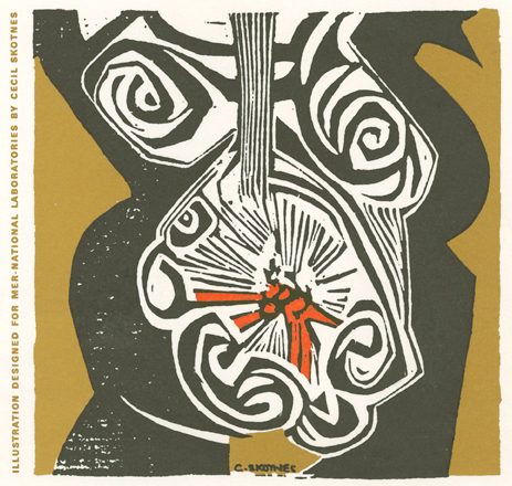 hese was the tile he made in 1969 for a pharmaceutical company. The design clearly exposes the artist’s glee in his illustration of a stomach ulcer (he, after all, was free of the affliction). ((Leaflet accompanying Kolantyl tile distributed by R-M Pharmaceuticals (Pty) Ltd. ‘Cecil Skotnes, perhaps more than most South African artists, has been deeply influenced by his African environment. In his work are to be found those elements peculiar to primitive sculpture and African art. But in Skotnes’ hands, this primitive formal idiom serves to increase his power of expression and raises those ornamental elements to something far above the level of mere decoration. This is particularly true of the Kolantyl tile which appropriately shows an ulcer sufferer. Freed from the bonds of realistic treatment, the tile does not merely show a wincing face or a clinical picture of an ulcer in situ. Instead these elements combine in a dramatic representation of the agony, discomfort and loneliness of the ulcer sufferer. The dark figure writhes in pain on an acid-ochre background through which the name Kolantyl appears. The strong contrast between the tortuous black and white lines contained within the figure, and their violent distortion make a forceful expression of pain and spasm. All trivia have been eliminated and only the fundamental forms emerge with full emotional impact. The searing red of the ulcer site radiates from a focal point in needles of pain. Colour, rhythm and line have been intellectually manipulated to convey a strong emotional experience. Despite, or rather because of the abstraction we are left with a clear experience of reality and we are even more able to sympathise with the ulcer sufferer. Skotnes has given a precise definition to the problems of ulcer management. By showing these emotional aspects as well as the accompanying pain and spasm he is indicating that there is so much more to an ulcer than just pain .’ Also see Artlook 58, September 1971.)) He happily co-operated when Vittorio Meneghelli asked several artists to design costume jewellery made from bones ((This project is reported in The Star, 12 and 20 March 1970; and Artlook, March 1970.)) He entered the pavement art competition held outside the Goodman Gallery in Hyde Park, Sandton, in 1972, winning second prize. ((The first prize – a trip to Paris – was won by Leonard Matsoso, and the third prize went to Bettie Cilliers Barnard.)) And in 1979, on the occasion of a Fook Island picnic held in the Pretoria Art Museum in honour of King Ferd III (alias Walter Battiss), he made what he called The Mallet of Light and Creative Insight and wrote a humorous citation which documented an apocryphal shared ancestry of the two artists.
He designed the stamps, issued on 31 May 1966, to commemorate the fifth anniversary of the Republic of South Africa. The first set he submitted was rejected because the Minister of Posts and Telegraphs considered the images to be too abstract, but even the stylised designs that were issued were to cause considerable controversy. ((See F G E Nilant, Historia 1966; Dagbreek, 24 April 1966; Sunday Times, 24 April 1966; Beeld, 17 April 1966; Vaderland, 20 April 1966.)) The following year another stamp he designed was issued in the definitive series on 1 March. All these stamps still bear the legend ‘Republic of South Africa’ alternating with ‘Republiek van Suid-Afrika’. Skotnes suggested this be abbreviated to RSA, suitable for both official languages. In 1967 this convention was implemented and used ever since.
As a result of bonhomie and a good lunch, he designed labels for wine that were innovative in the South African context. John and Erica Platter, who commissioned them, elucidate:
Delaire’s label is the first in South Africa to feature the work of a leading fine artist. Our distinctive eagle is the inspiration of Cecil Skotnes whose artistic reputation needs no elaboration … He chose to depict the eagle because the name Delaire is based on the French word for an eyrie, which exactly reflects our vineyard and position, high on the Helshoogte Pass. Cecil introduced his own quirkish sense of humour to the woodcut by contriving a wine-bottle perch for the eagle. ((From a pamphlet that accompanied the wine when it was brought onto the market. For the story of the label’s origin see Erica Platter, ‘The art of wine’, Art, No.3, February 1989.))
Despite his interest in the head as a subject Skotnes only rarely puts his hand to portraiture. Sometimes he models the heads in clay, but more frequently he draws, gouges and engraves, or paints them. When he met film actor Anthony Quinn in 1976 he felt inspired to portray that rugged, almost peasant face as an incised painting. Skotnes recalls the event:
Quinn, who is a woodcarver himself, spent a few days in my studio. I did some drawings of him and after he left I found a note attached to a rather good photograph of him saying, ‘See if you can fix the face’. I worked on my drawings and thought along the lines of an allegorical portrait. It wasn’t the kind of face I wanted to do in a realistic manner.
The reporter of The Star continued:
The face had many characteristics and appeared to Skotnes to grow from the inside out. The result was that he started with the nose. Dispensing with body and shoulders he ended with the head only in a 1 ,2 x 1,2 metre format. ‘I sent Quinn a transparency of the work, which I intended exhibiting in a show I’m having in September. A telegram came back, ‘Send it.’ And Skotnes sent it. ((The Star, 3 August 1976.))
In similar vein Skotnes made Portrait of a woman. Despite their drastic distortion and formalisation which almost deny them their humanity, these portraits have a presence which can convince viewers that the likenesses are true.
Portrait of Adèle Davids, painted on commission in 1988, proves that Skotnes can be conventionally realistic. He made drawings and photographs while the old lady sat for him and later he painted the picture from these preparatory studies. He ignored the family’s request that he should portray her as she was in her prime. He depicted her frail, aged body and did not deny that the face and hands, too, were old. Nonetheless, in this face and the hands he detected and immortalised her ever-young, astute mind and indomitable spirit. Details of clothing and the chair in which she sat are accurately recorded in the picture, but the small still life in the upper right background is fantasy. Its discreet intrusion, colour and luminosity give the formal, yet penetratingly sensitive portrait an extra dimension which may be interpreted variously according to the viewer’s temperament and insight.
In the mid-nineties Skotnes set out to make imaginary portraits of some of his ancestors. His ‘models’ were the stories of their lives and exploits because there were no photographs to guide him. Since he aimed to express character rather than likeness, these memories of the family legends proved to be ample stimulation for the artist’s creative mind. Arguably these ‘portraits’ are more true than any images of external appearances could be.
![]()
Concern for the community
Besides his teaching activities, which are discussed in the next chapter, Skotnes frequently acts as spokesman for South African art, here and abroad. He succeeded Walter Battiss as President of the South African Council of Artists in 1962, and in that capacity he, accompanied by Armando Baldinelli, represented South Africa at the Fourth International Association of Plastic Arts Conference in New York in October 1963. This was the first time South Africa had been represented at the conference. ((See Esmé Berman, Art and Artists of South Africa, 1983, pp.375-376.)) After the conference Skotnes toured the United States for about a month to study art education in America as well as doing public relations work for art.
In 1970, together with Walter Battiss, he formed the Africa Council of Art to succeed the by then defunct South African Council of Artists, but, as Skotnes recalls, ‘it died before it got underway’. ((The Star, 21 October 1970, and Cecil Skotnes intimation to FH, 26 August 1994.))
In 1963 he was called as one of the expert witnesses ((Other witnesses for the defence were art historian Heather Martienssen, poet Uys Krige, Richard Daniel and Br Roger from the Community of the Resurrection.)) in a trial in which the painter, Harold Rubin, was accused of blasphemy. This arose from an exhibition entitled ‘My Jesus’, a series of paintings symbolising universal man, but with an unmistakable political twist. One picture depicted a nude Christ on the cross with the face of an animal. Beneath this image was a policeman with a sten gun confronting a black man with a spear. What was found to be most offensive, however, was the inscription, ‘I forgive you, Lord, for you know not what you do’. Not surprisingly this case – used to support the introduction of the censorship bill – attracted much media attention and was avidly followed by the public. Skotnes’ s statements for the defence carried great conviction and contributed in no small measure to the accused’s acquittal. ((See The Star, 21 and 22 January, and 5 February 1963; Die Transvaler, 23 January 1963; Rand Daily Mail, 22 and 23 January 1963; Die Vaderland, no further information in Skotnes scrapbook.))
Sometimes Skotnes writes and publishes when he feels the need to draw attention to pertinent issues concerning art in this country. In the past he has been primarily concerned with the neglected art of the black community, and he has no doubt contributed considerably over the years to its recognition as a vital force in our multi-cultural society. In such articles and papers read at conferences he was also the champion for art education. ((See list of publications by Cecil Skotnes in the Bibliography.)) He speaks out fearlessly about issues close to his heart when interviewed. ((See, for instance, Madeleine van Biljon, ‘Mentally bankrupt!’, Sunday Times Magazine, 29 March 1981.))
Skotnes did not indulge in the making of what is known as ‘protest art’ which flourished during the last decade of the apartheid era. Artists were, however, expected to do so and therefore an interviewer asked him the inevitable question:
Do you believe that an artist, especially a South African artist, should make a statement through his work? I mean, specifically, a political statement?
Skotnes replied: It is extremely difficult to make a political statement through the visual art medium. A few great artists, like Goya and Picasso, did do so. I prefer in the main to make my statements verbally. I have done so in the past, and will continue to do so. I believe every artist should. If the theme of his statements comes through in his work [as we have seen, it did in the 1820 Settler Panels], well and good. ((‘Face to face’, Financial Mail, 6 May 1983.))
On an other occasion he said:
In difficult times, physically and spiritually, the creative person thrives because he responds and feeds off all human frailty, human love and human understanding, and he expresses these special human qualities. ((Cecil Skotnes in his opening address at New Dimensions in Arts and Crafts, November 1986.))
Drawings made during the eighties do, however, approach overt political commentary and surprised the critics:
Fusing elements of past and present, Skotnes develops contemporary allegories which make the myths and magic of Africa come alive. In the process, masked figures assume ambiguous characteristics and tribal trappings take on an altogether different character.
References to constraints and manipulation are frequent. Strange target-like body adornment seems to inhibit movement. Figures are suspended by strings, have keys for ‘winding up’, or may be restricted by clipped ‘wings’.
The introduction of foreign elements helps to demythologise the old Africa. Loosely worn masks hardly conceal the wearer in traditional ways and reveal human emotions such as puzzlement, wonder, surprise and anguish. Some face-masks appear more carnival-like than ritually orientated, while others recall medieval armour, or the plumage of birds.
There’s humour too – in the delightful Don Quixotic character on a horse and in the figure of a drunk at a table. Humour, pathos and irony combine, while elements such as shantytowns, scarecrows and greedy birds of prey provide the tapestry with a rich background texture.
Skotnes maintains his theme through various devices. Silhouette figures, for instance, recall another culture in our past – the San people. Pictorial space, too, is effectively used to create ambiguous planes and suggest various dimensions.
By humanising, personalising and cross-culturalising his African forms, Skotnes reaches out to a potentially wider audience. ((Benita Munitz, ‘A Skotnes we seldom see’, Cape Times, 31 August 1987.))
For Skotnes art is an essential part of life, and, despite his rejection of propagandistic forms of expression, he believes it is a driving and influential force. He said:
All the arts are a force for change. Perhaps not in the way one might think, not as a poster-like art describing violence or portraying anti-discrimination, but because art is an element of freedom.
The artist is also in a fight for freedom for the self. Most totalitarians try to make art fit their own ends, because they see that artists don’t usually fit into an oppressive society … Art grows out of the mind of freedom … The moment the arts are controlled, for whatever reason, you move towards a fascist society. ((‘Interview with Cecil Skotnes’, CAP (Cape Arts Project) News, March 1987.))
An honorary masters degree in Fine Arts from the University of Cape Town was conferred upon him in 1993 mainly because:
Cecil Skotnes is arguably South Africa’s foremost living artist. His personal achievements have been prodigious and he has earned much honour and acclaim during his own lifetime. But he is an artist who has enriched the community with more than the agitations of his pencils, chisels and brushes. He has represented his colleagues, gathered and defended the ranks, and shared and nurtured their creative impulse with his encouragement and teaching. ((Citation upon the conferment of the Degree of Master of Fine Arts, honoris causa, University of Cape Town, 24 June 1993.))
In April 1996 he was awarded an honorary doctorate in Fine Arts from Rhodes University, Grahamstown, and a honorary doctorate of Literature from the University of the Witwatersrand, Johannesburg.
Harmsen, Frieda. 1996. Artist resolute. In Harmsen, F. (ed.). Cecil Skotnes. Cape Town: South African Breweries. 11–63.